Background
This blog post comes from a presentation I gave a few years ago. It will walk through a demonstration of cross-validation for comparing predictive models. I assume you already know about cross-validation and won’t spend much time explaining it. Working through how this presentation functions is the main focus. The exercise works by having your co-workers (or other people) stand on a large grid marked by string. Each person has a toy animal representing their class, either African mammal or dinosaur, with information attached.
The toy also has a tag with:
- ID number
- x-position of X1
- y-position of X2
- fold number.
I used X1 and X2 instead of x and y since y is often reserved for the class, but x and y can be used. People will move on and off the grid as the toys move in and out of hold-out sets for different folds. Predictive models are built and tested to determine the best one. There are many variations on this idea, so feel free to change this up to suit your situation.
I’d recommend starting with a brief explanation of cross-validation and when/why it is used. I usually have slides with a curve of data (like y = x^2 + noise). Then show three models: a line, a curve, and one that goes through all data points but is very squiggly. Then add in some data to estimate and show that the curve fits best. Or something similar to get the general picture.
(As a side note, this presentation was inspired by the Dance Your Ph.D. contest. I’m not good with music, but if you are, I’m pretty confident this could be a dance instead.)
Setup
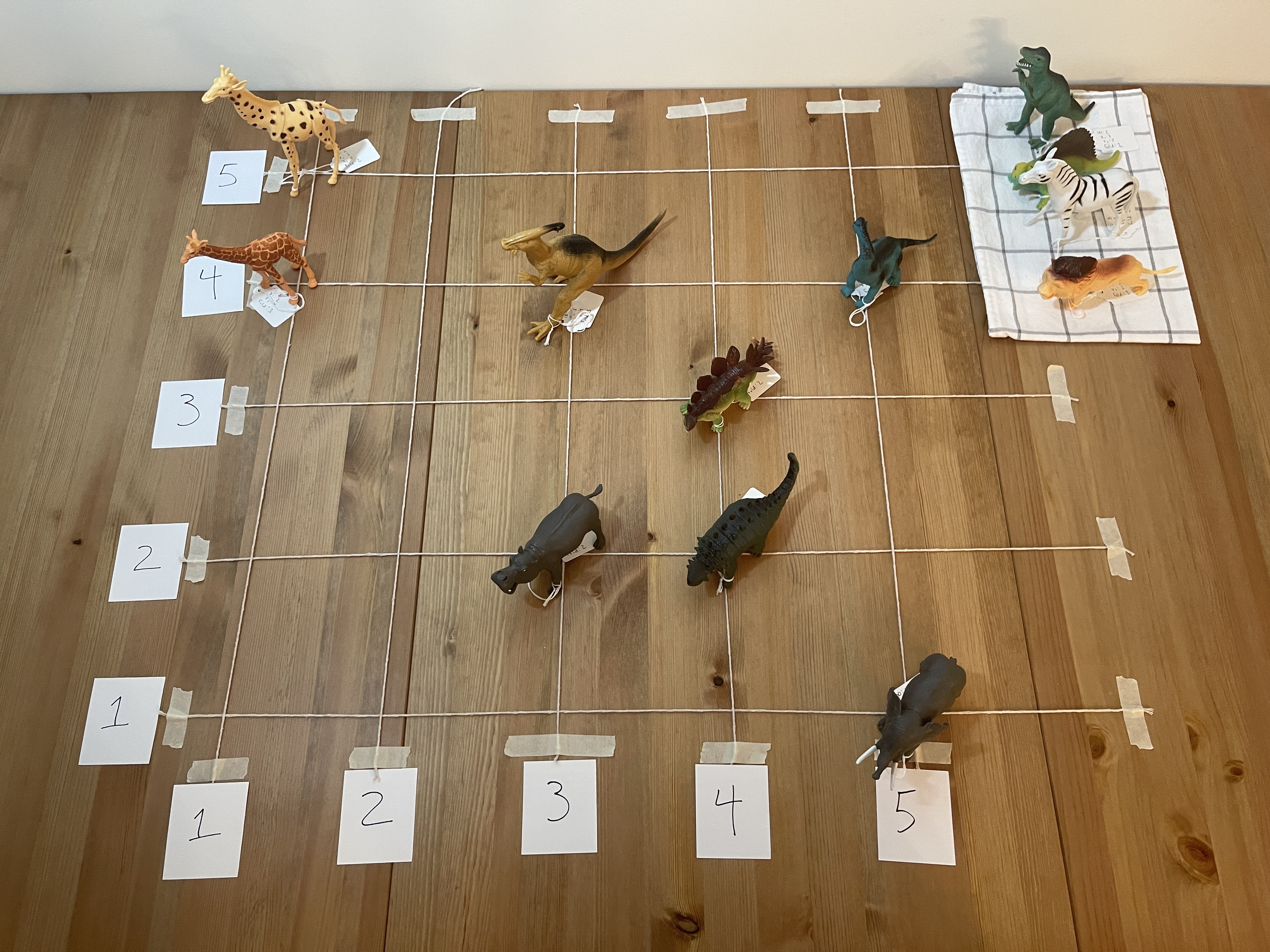
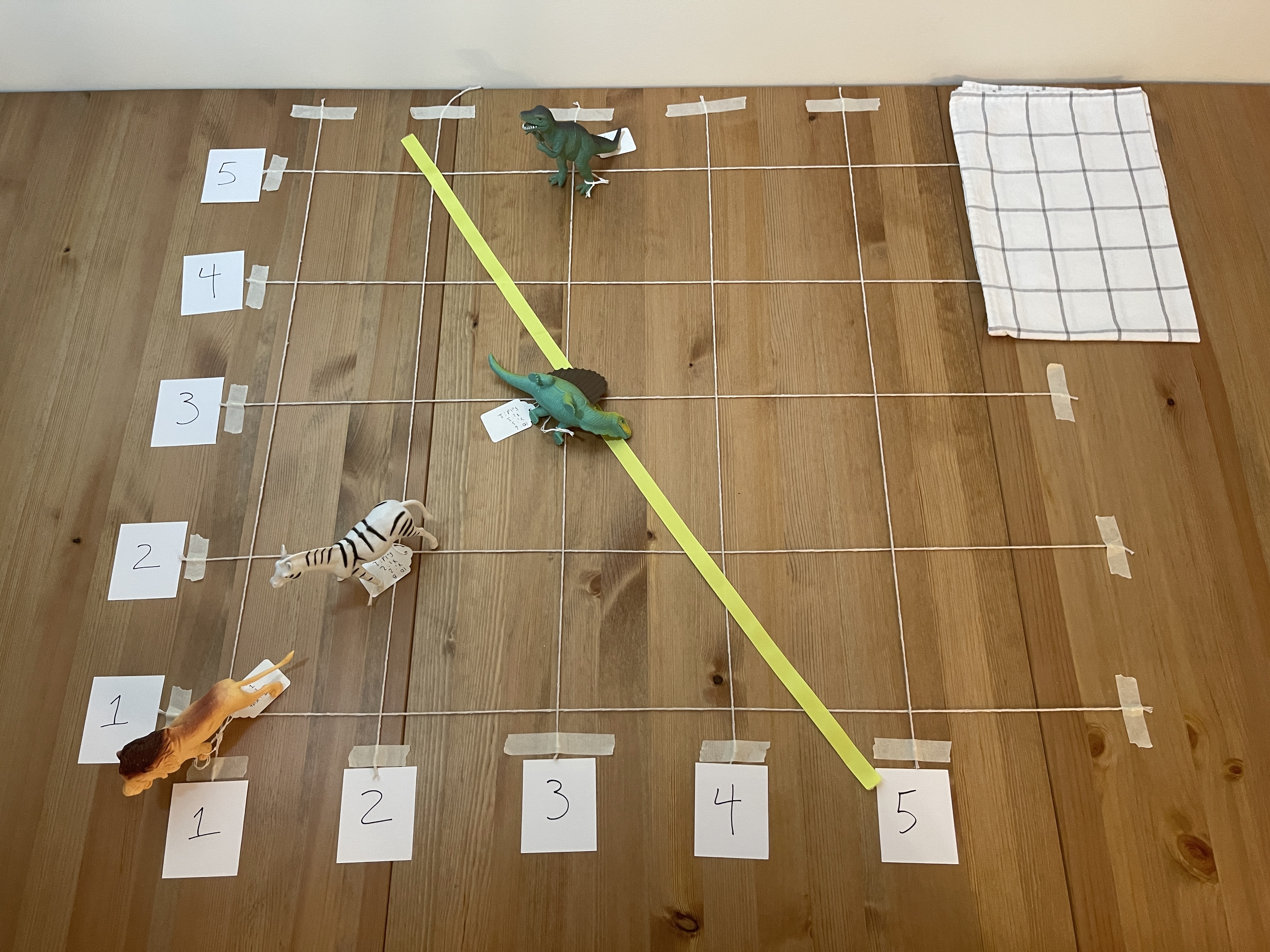
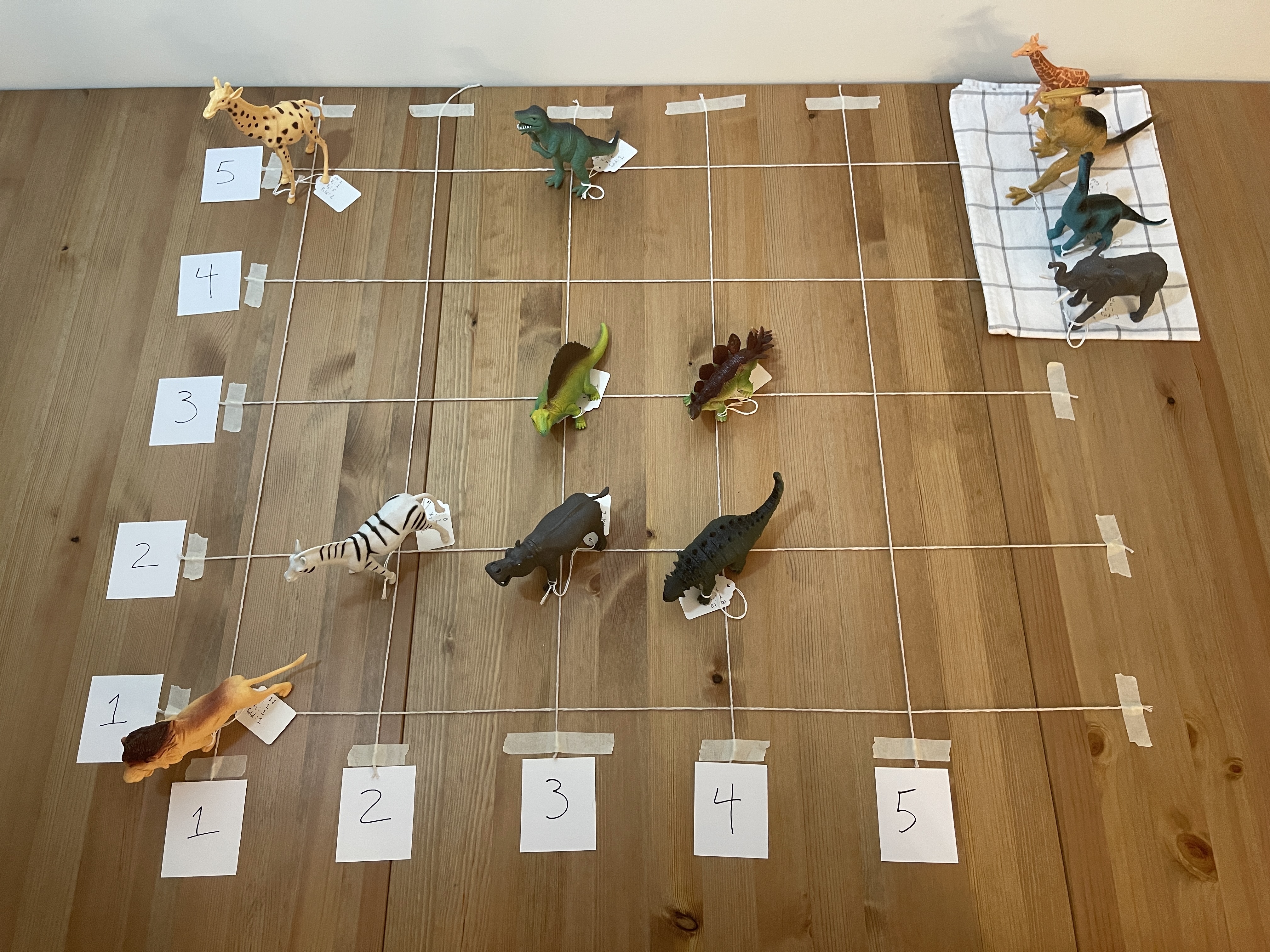
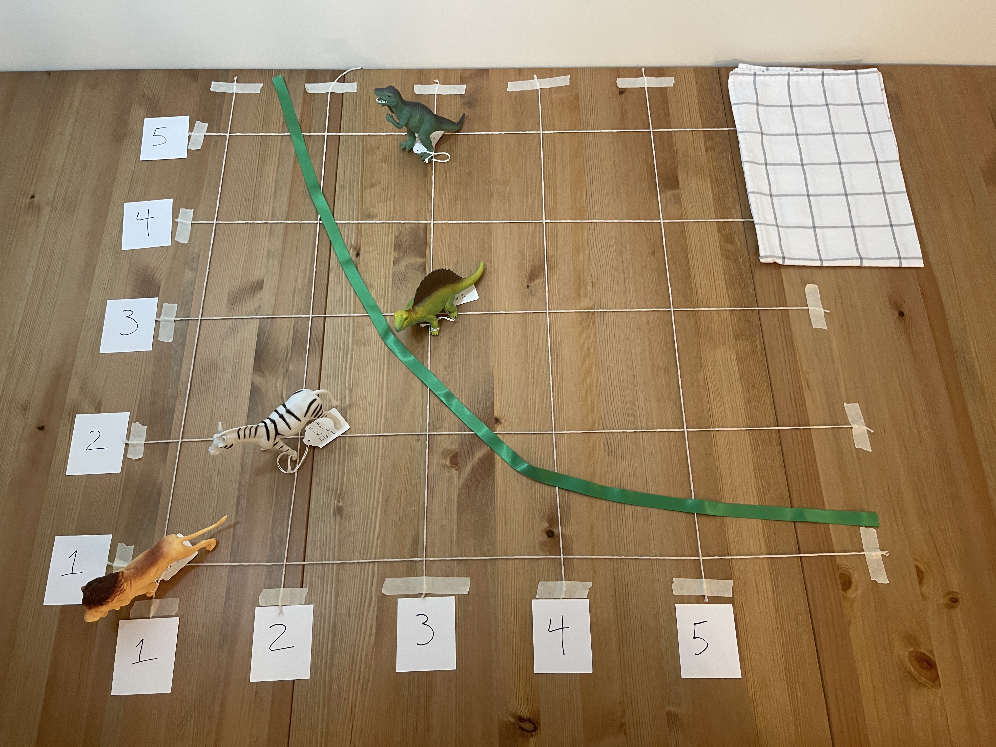
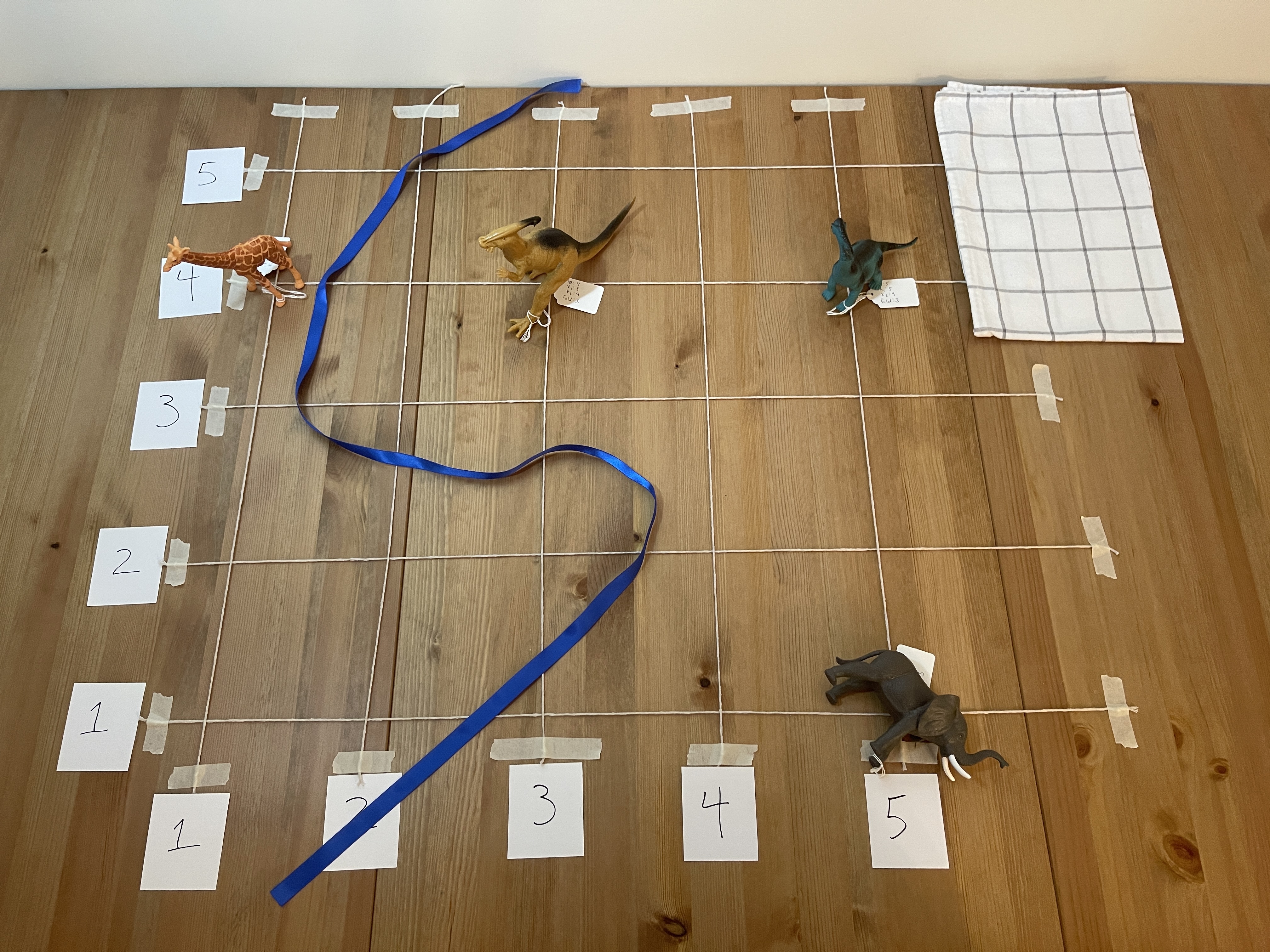
The following picture gives a general idea of the setup. I’m using a table for the photography, but it would be much larger on the floor. I had small cones for the axis labels, but there are small pieces of paper here. String or tape can mark the grid lines. The axes are generic X1 and X2, but they can represent variables like height/weight ratio or transformations like PCA.
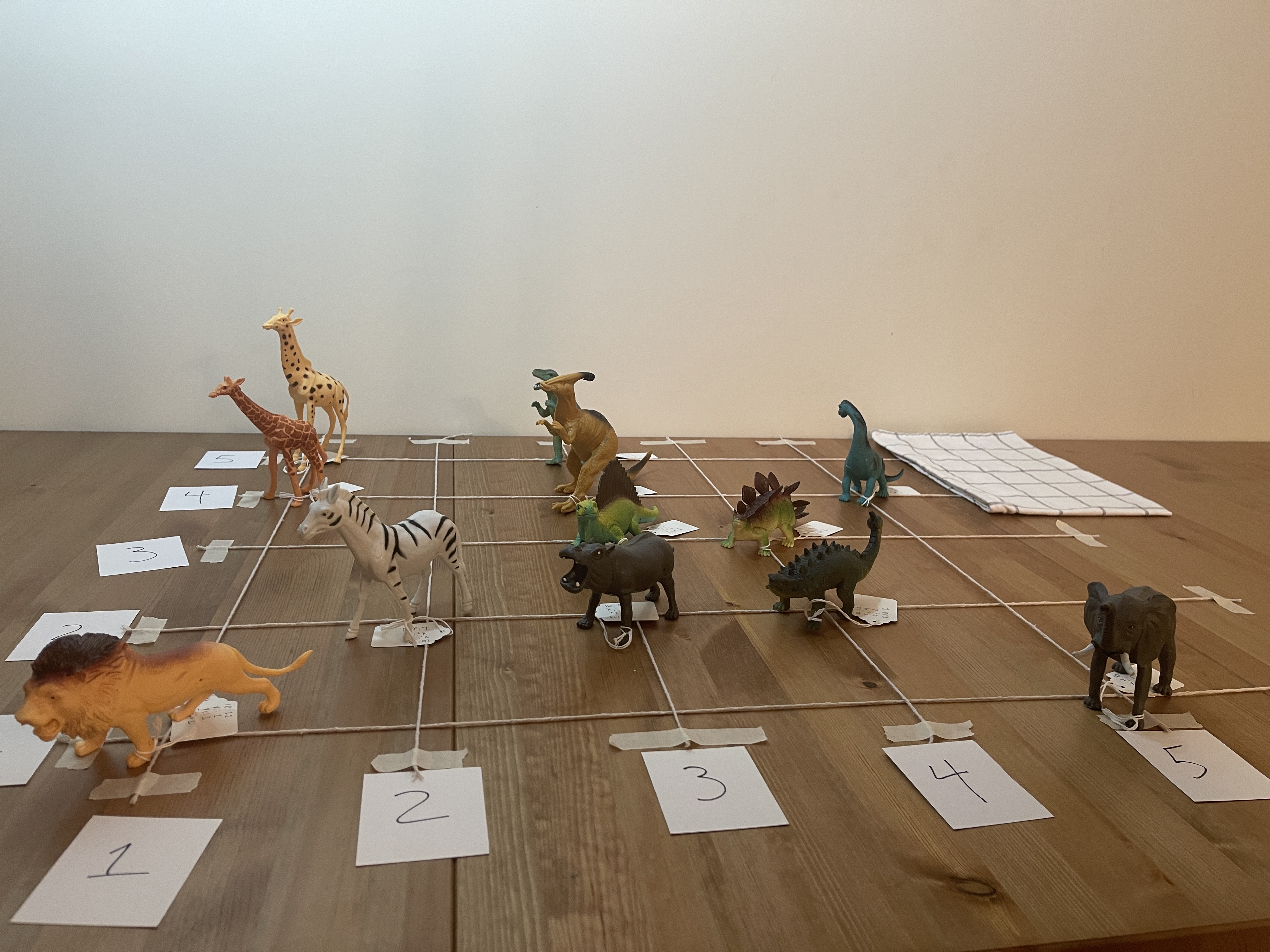
The exercise aims to create models using ribbons, to separate the mammals from dinosaurs. The ribbons are different lengths to represent the different flexibility of models. Then, we’ll test each of the models using cross-validation to estimate how well each one would perform on new data.
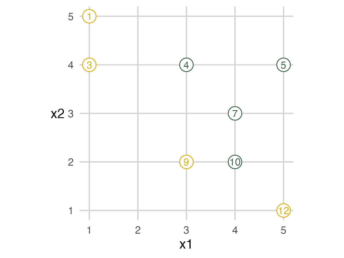
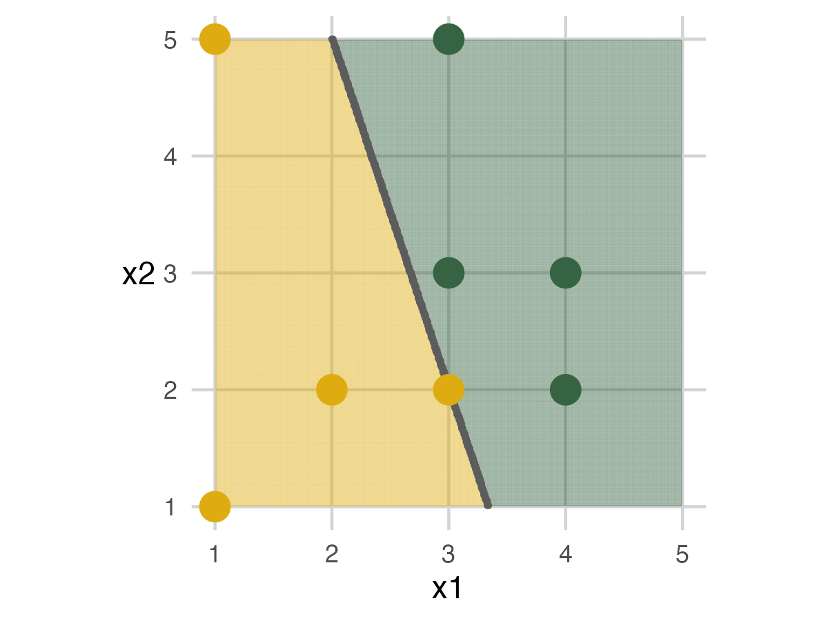
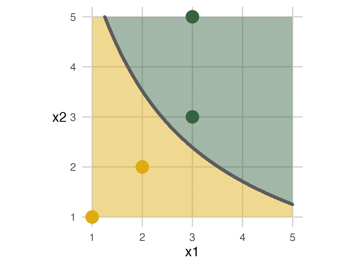
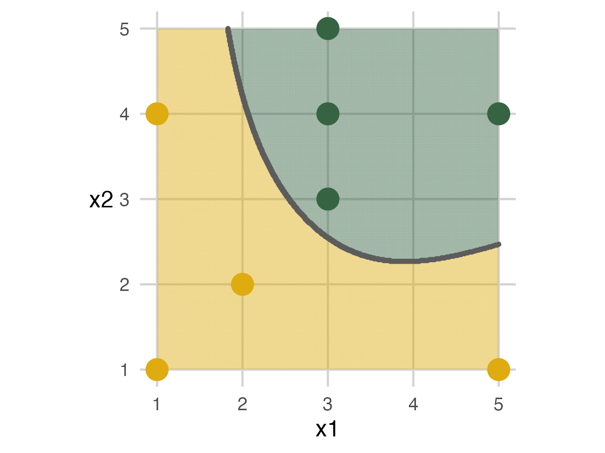
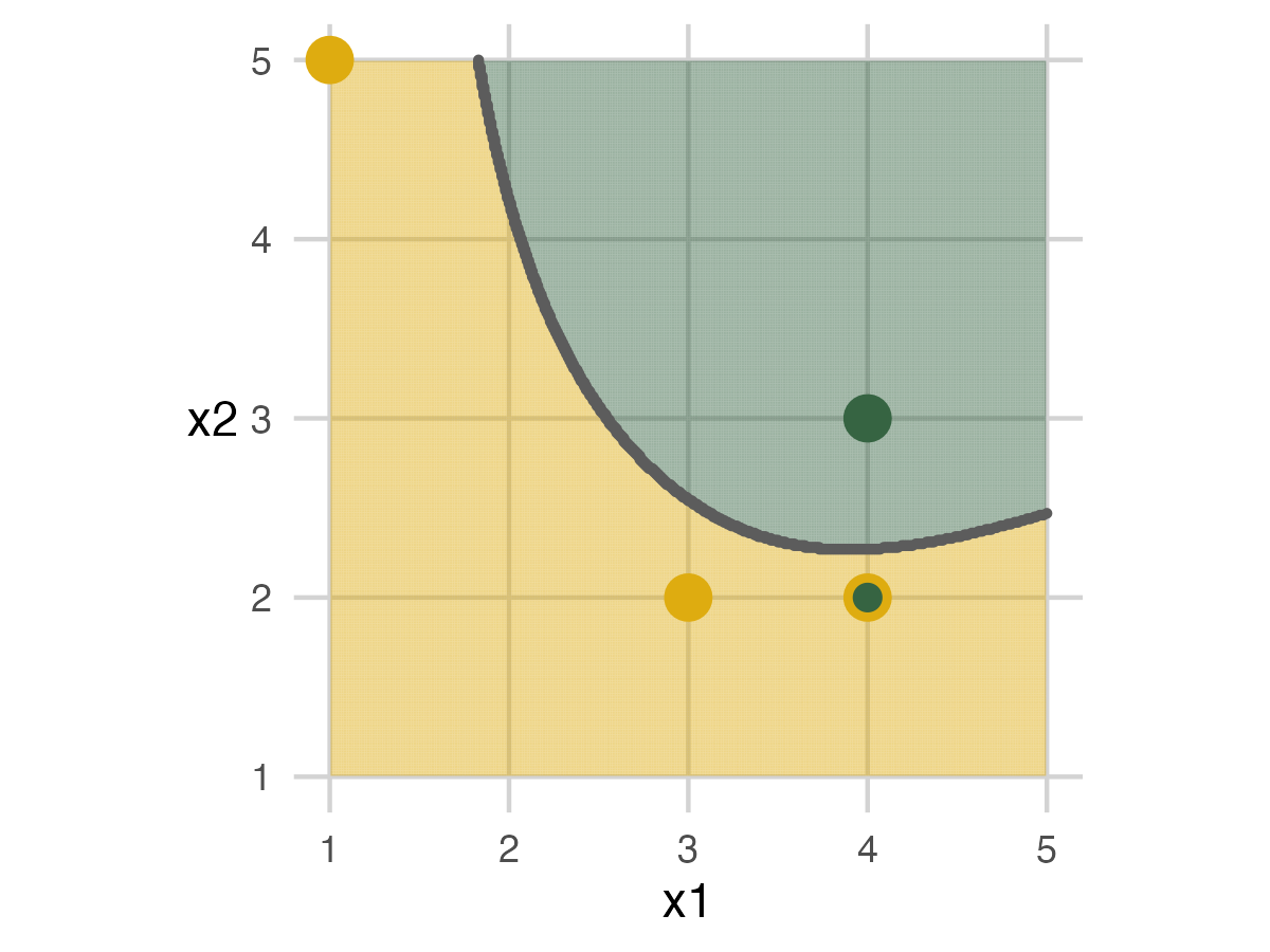
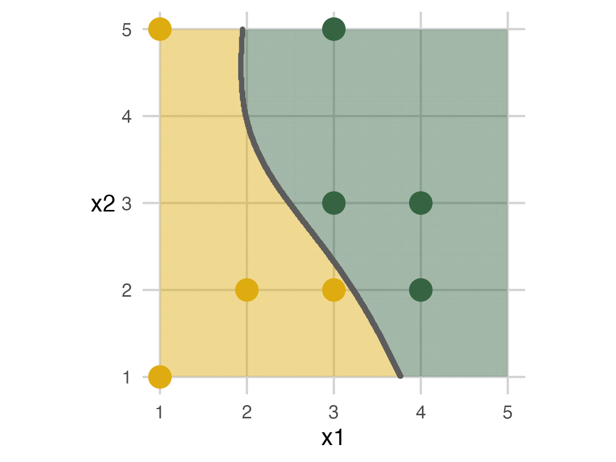
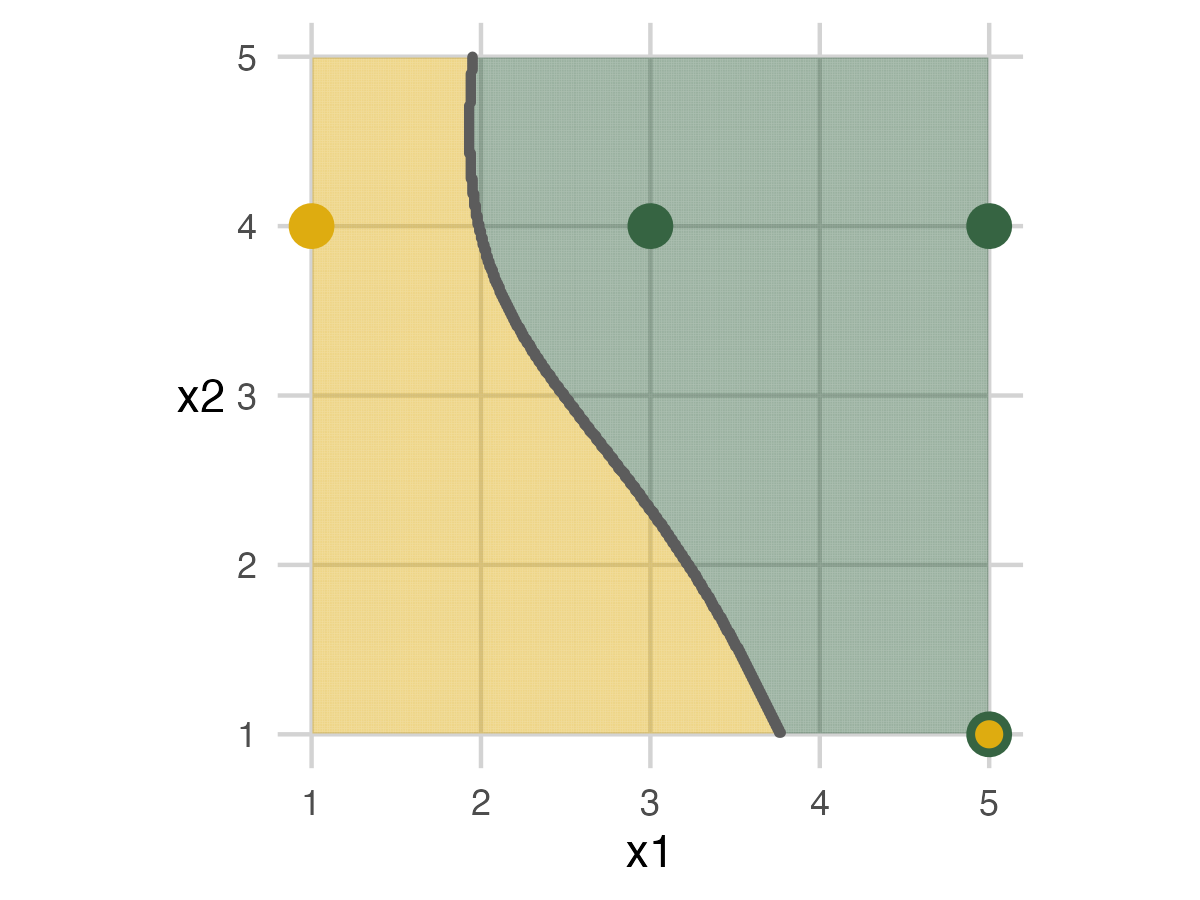
I created test data sets to determine the toys’ positions and folds until I got some with the desired attributes. I used twelve animals, but your number will depend on the people you have. There are three folds and three models. Each fold has four animals, two mammals and two dinosaurs. The three models are a straight line, a curve, and a squiggle. I wanted some variety with accuracy, none of the models to be perfect, and have Model 2 to be the best. I created a decision boundary of a curve to get started. All animals are positioned on integers, with African mammals on the left/below the curve and dinosaurs on the right/above. Then I sampled data sets until I got some with the desired properties, compared them, and chose one with nice images. You can see the code in this repo.
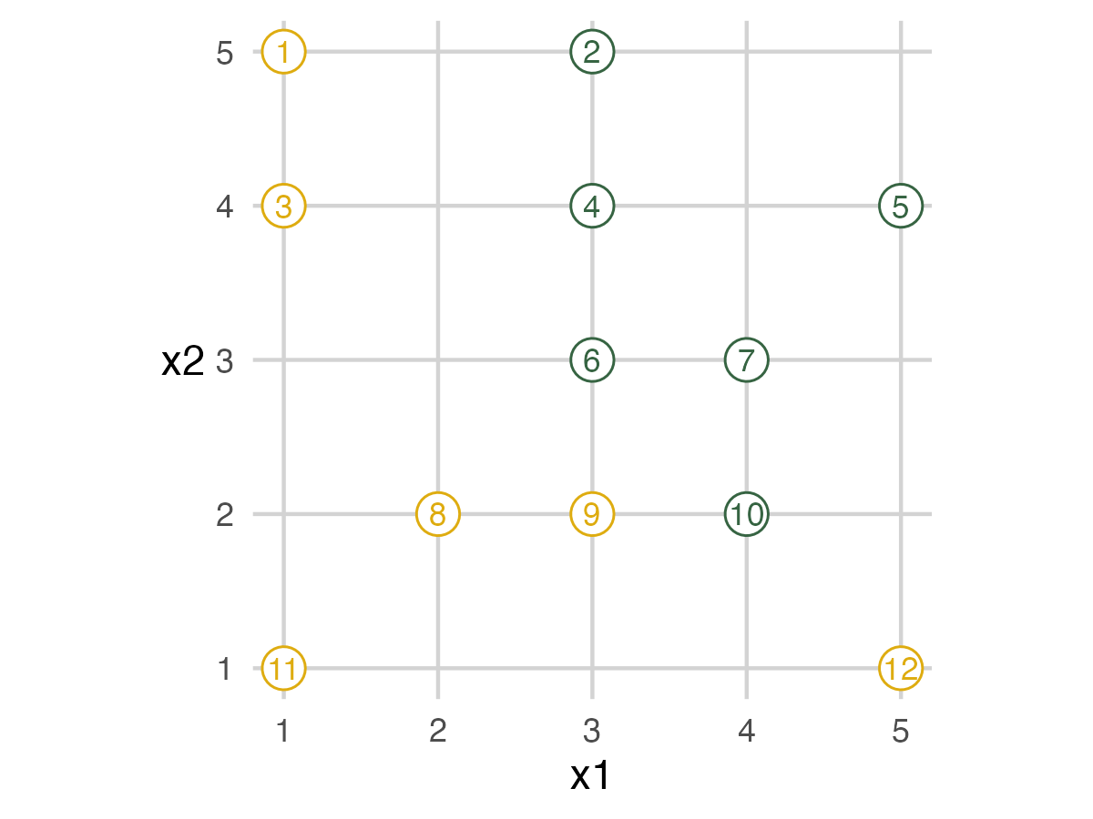
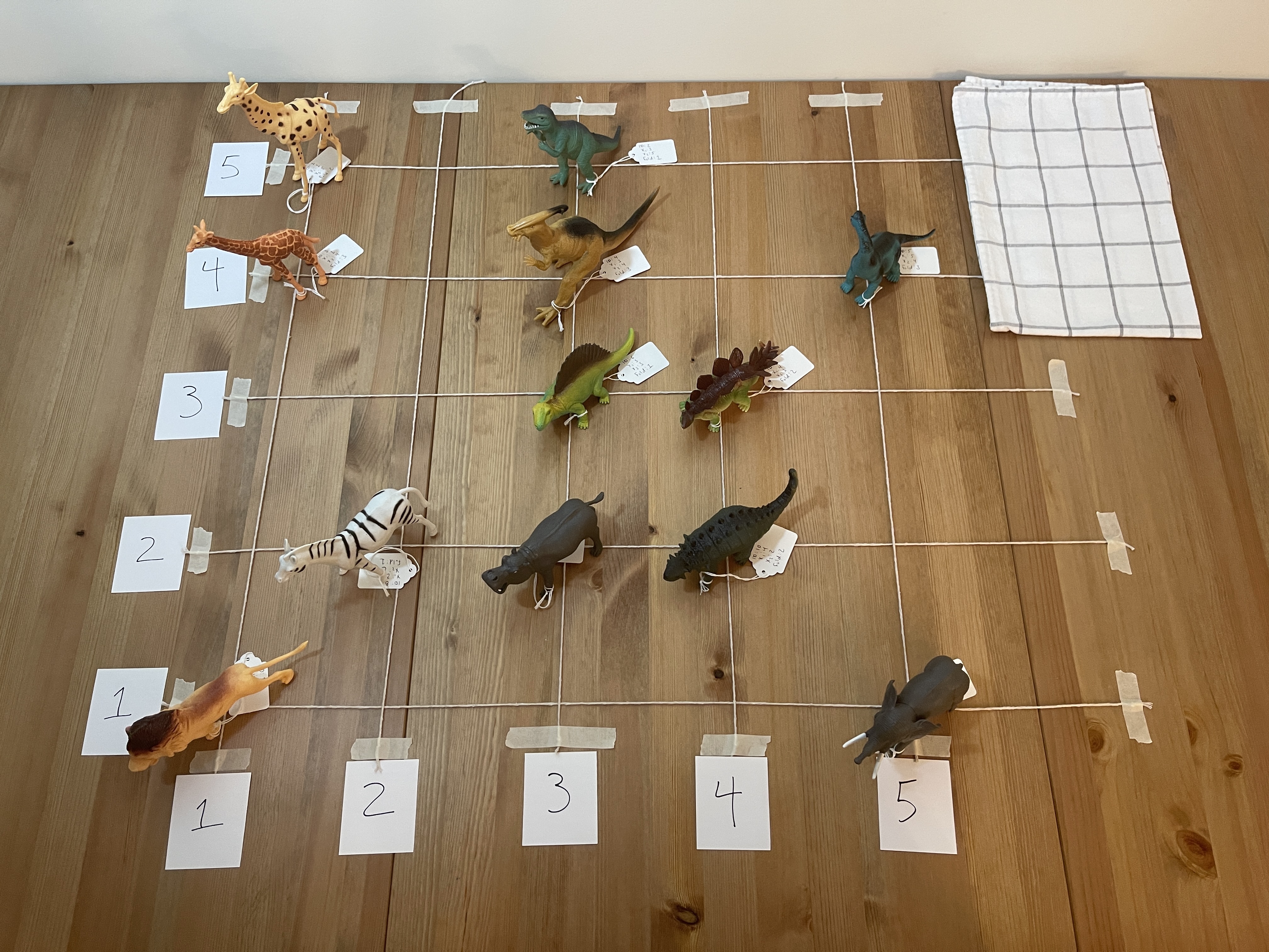
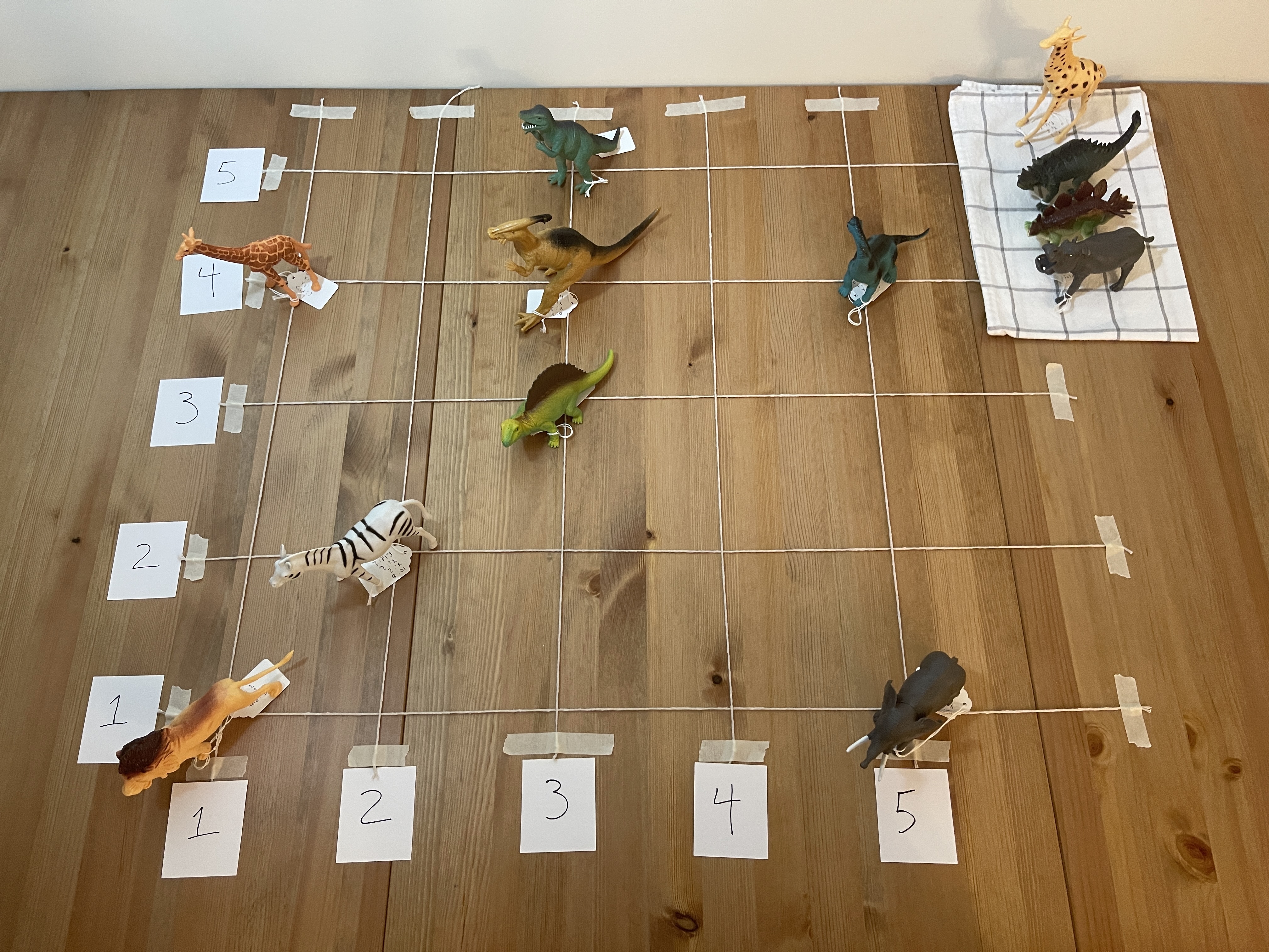
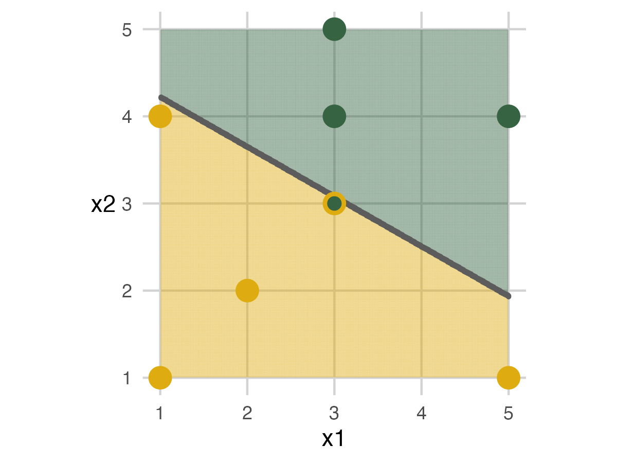
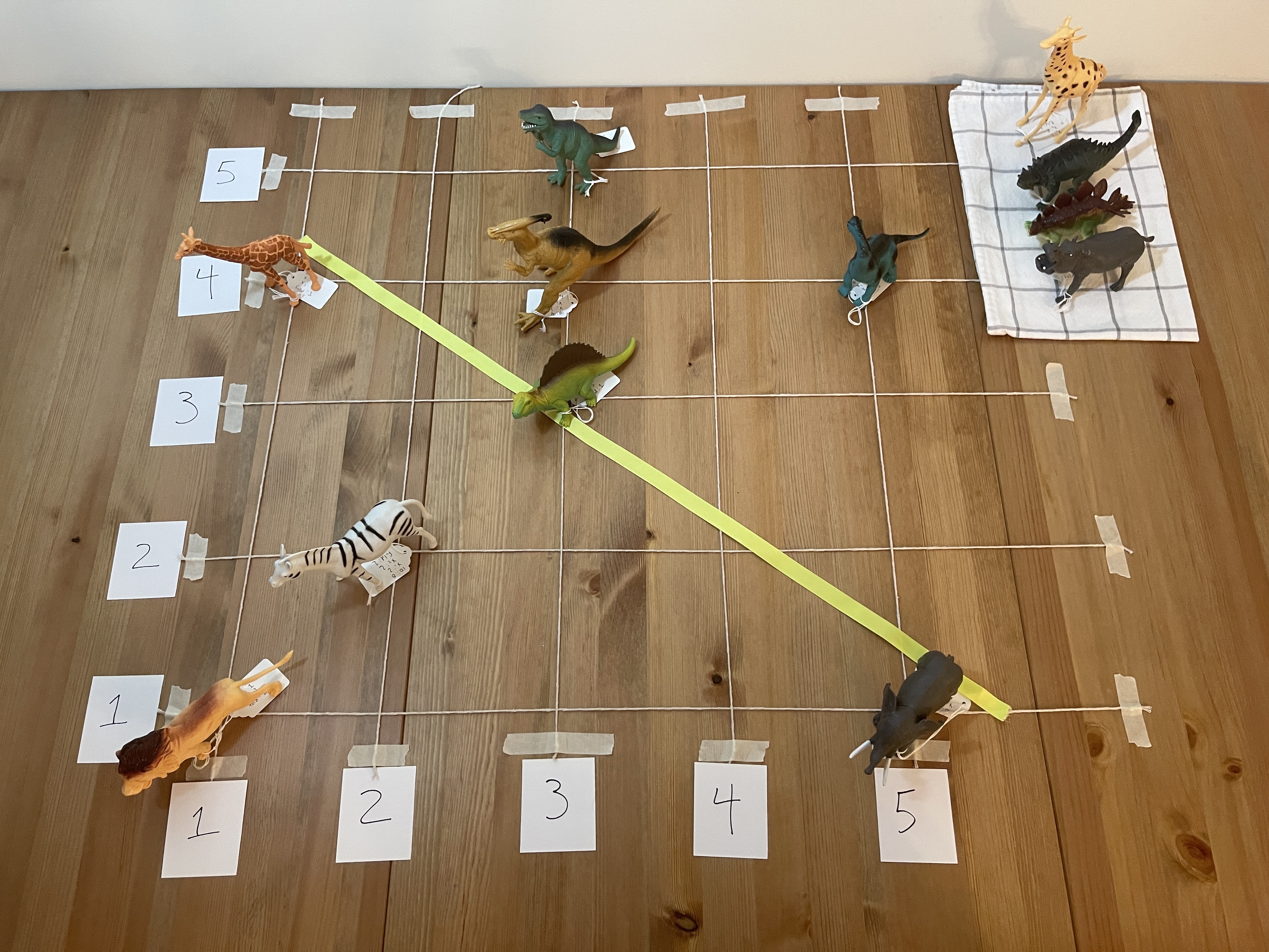
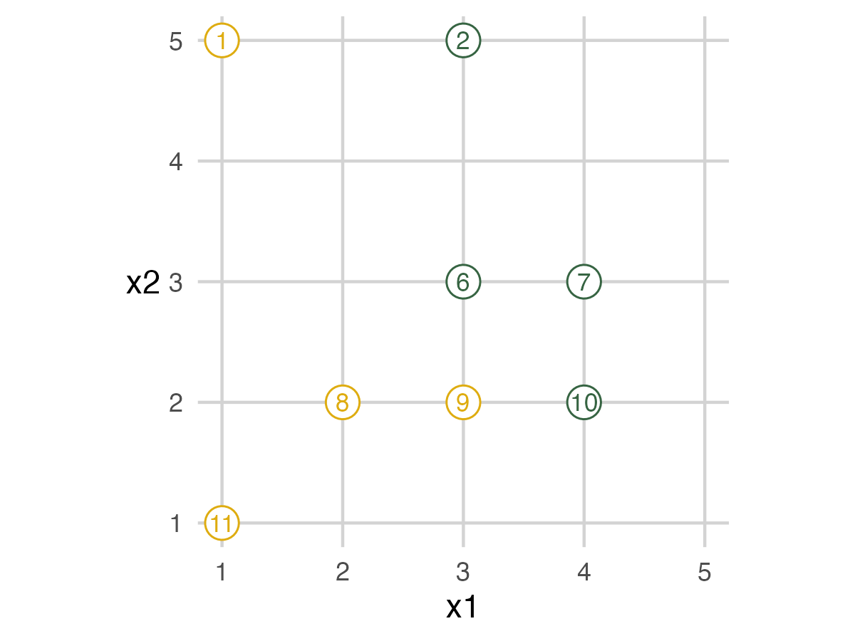
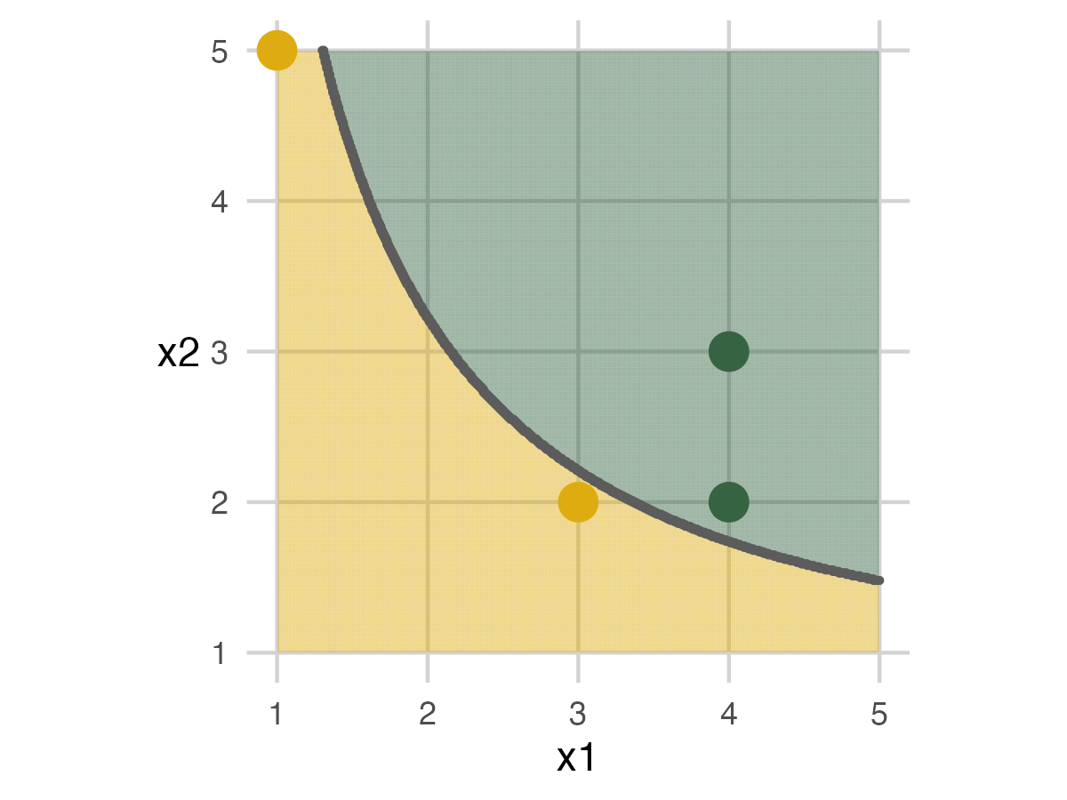
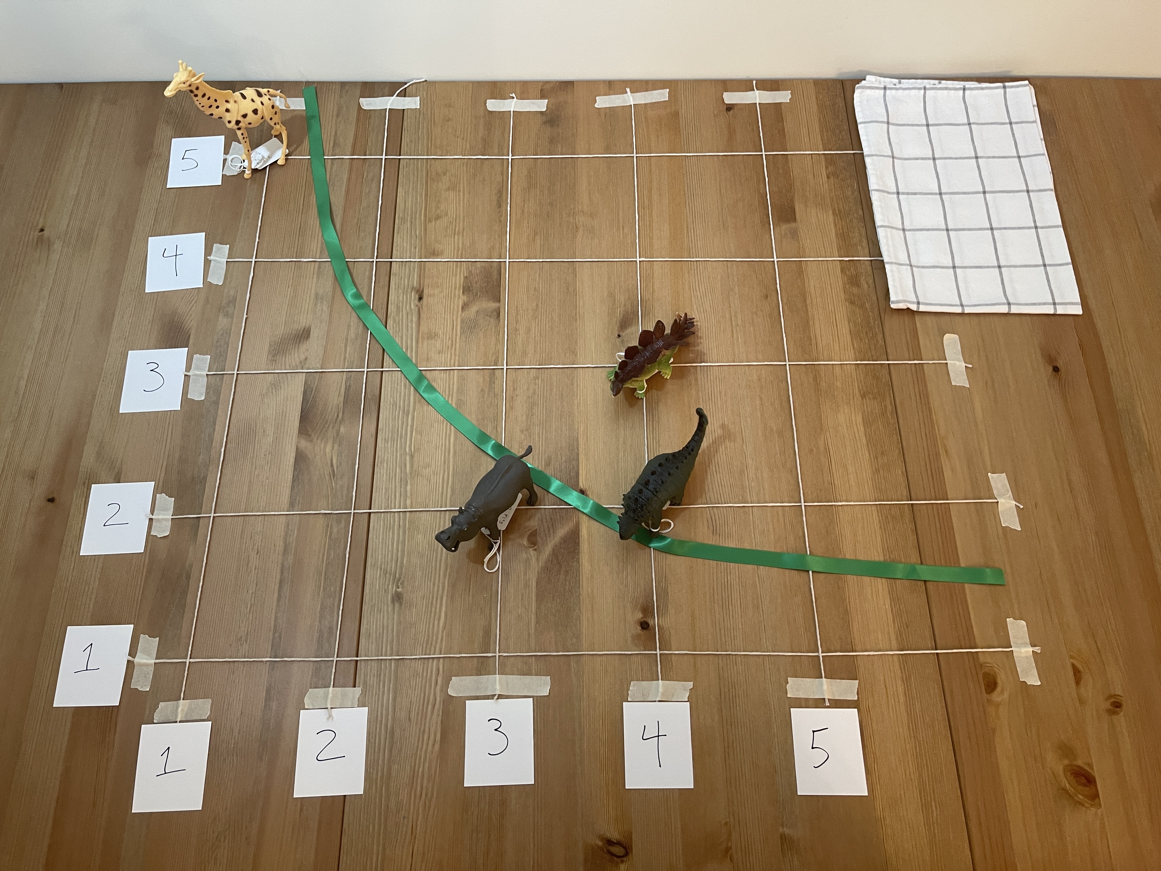
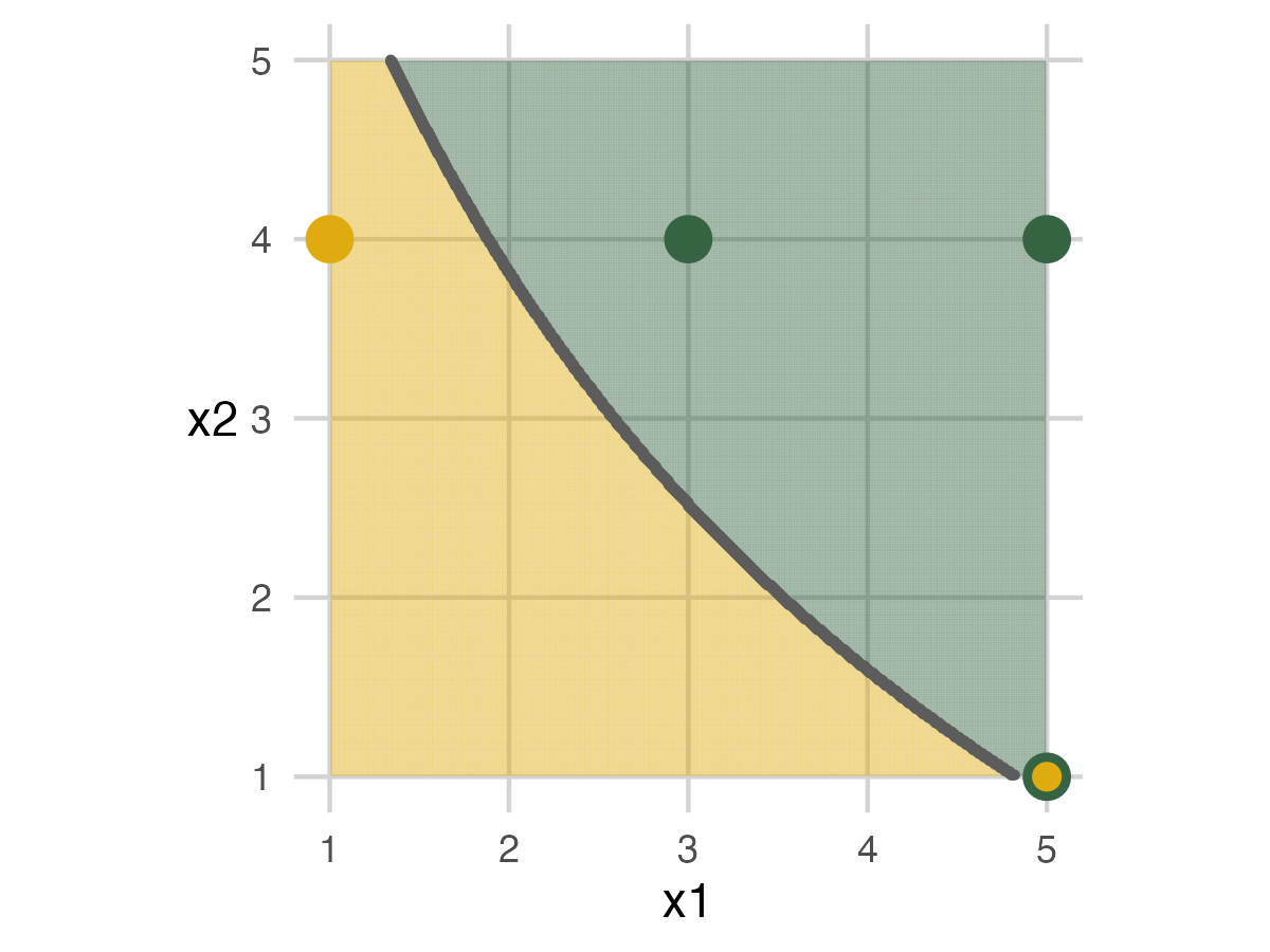
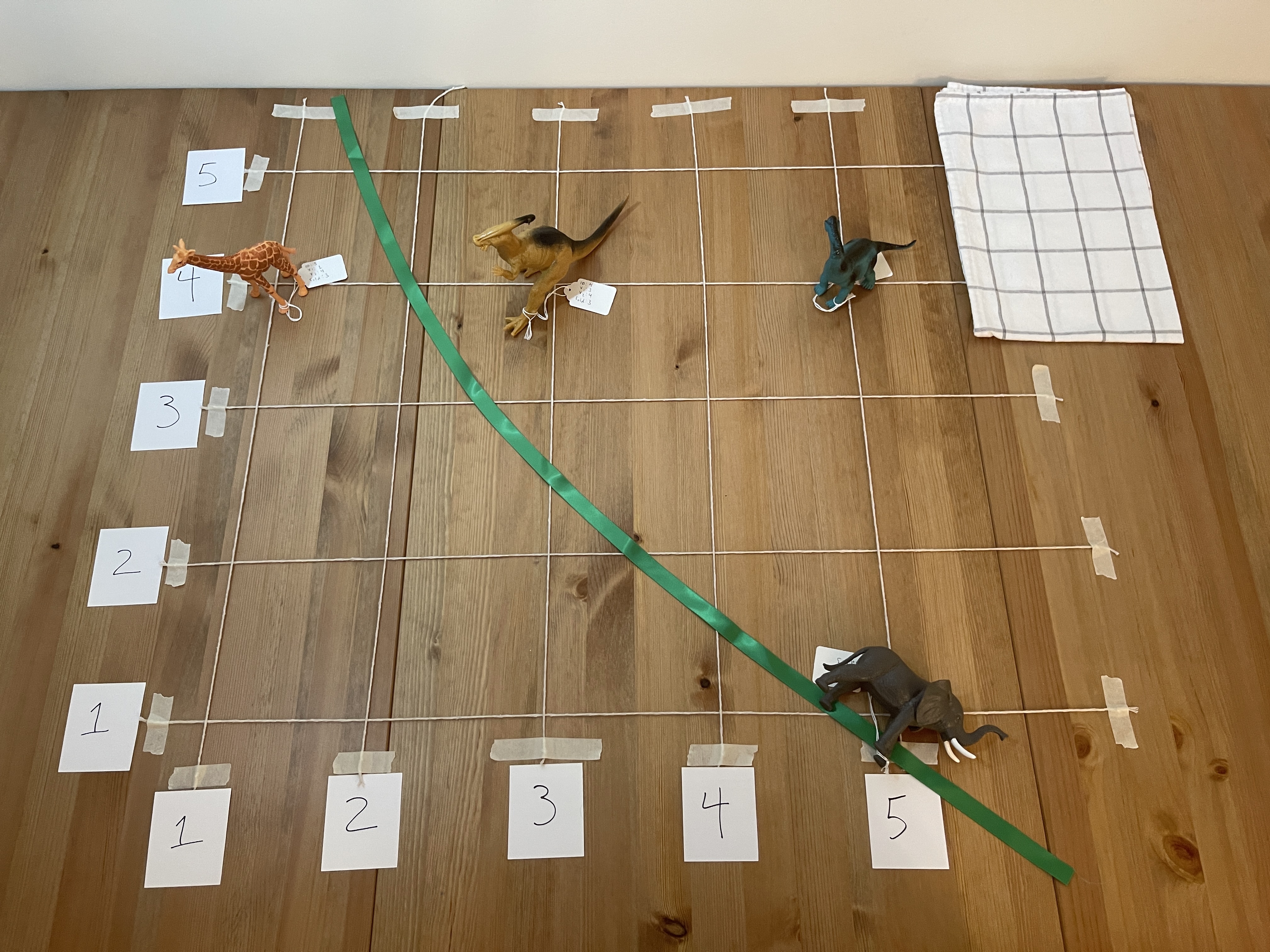
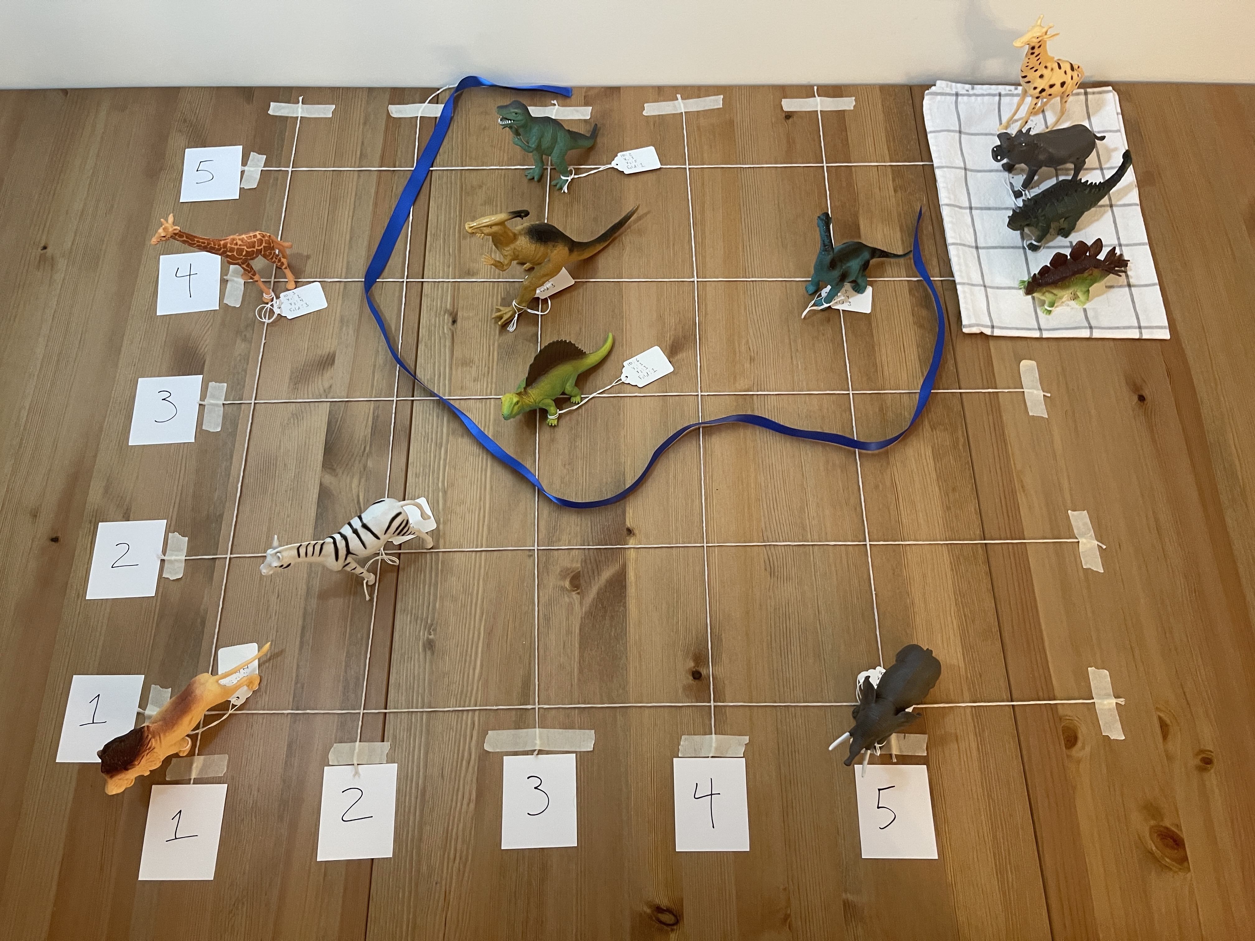
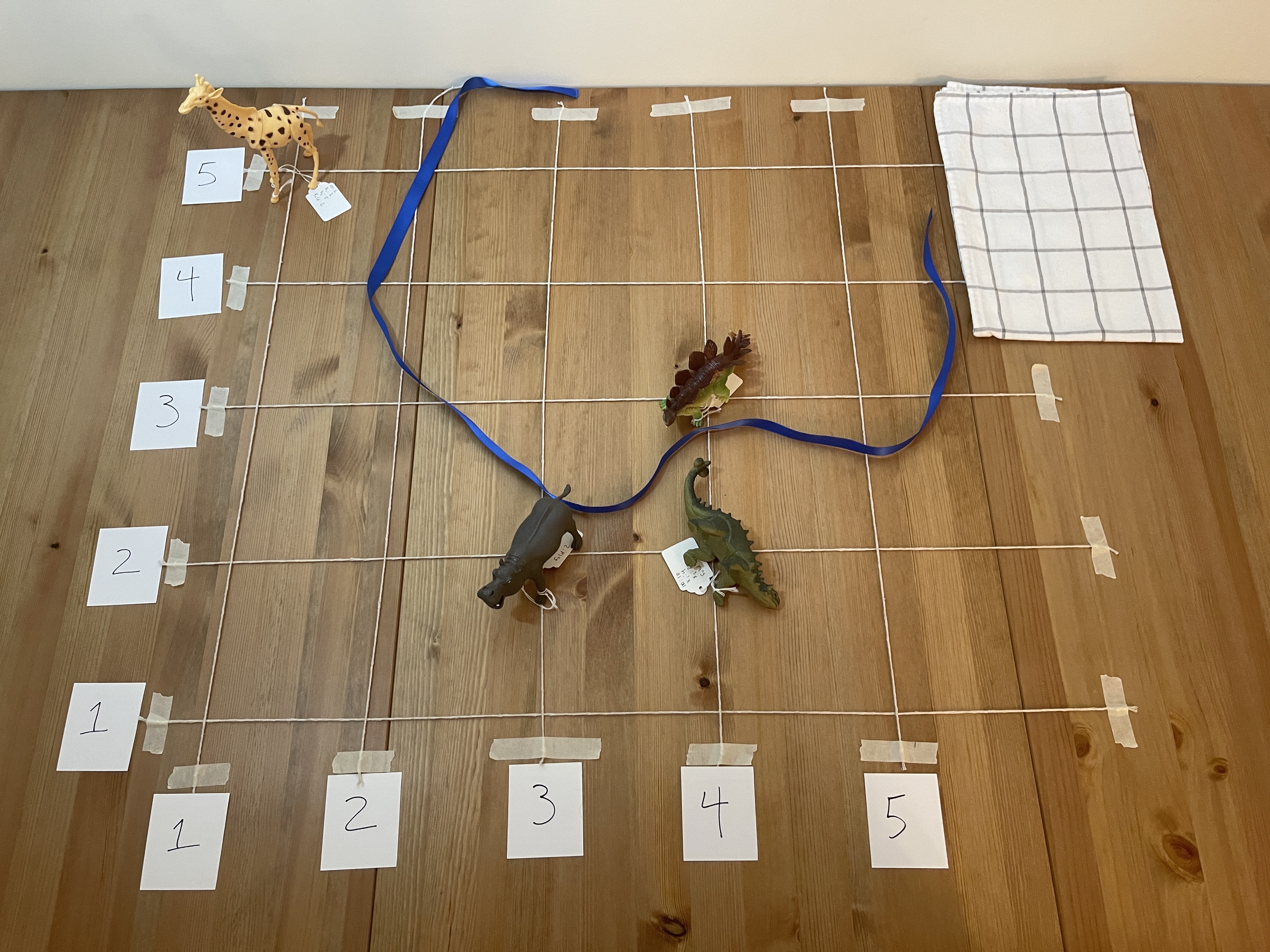
Full Data Set
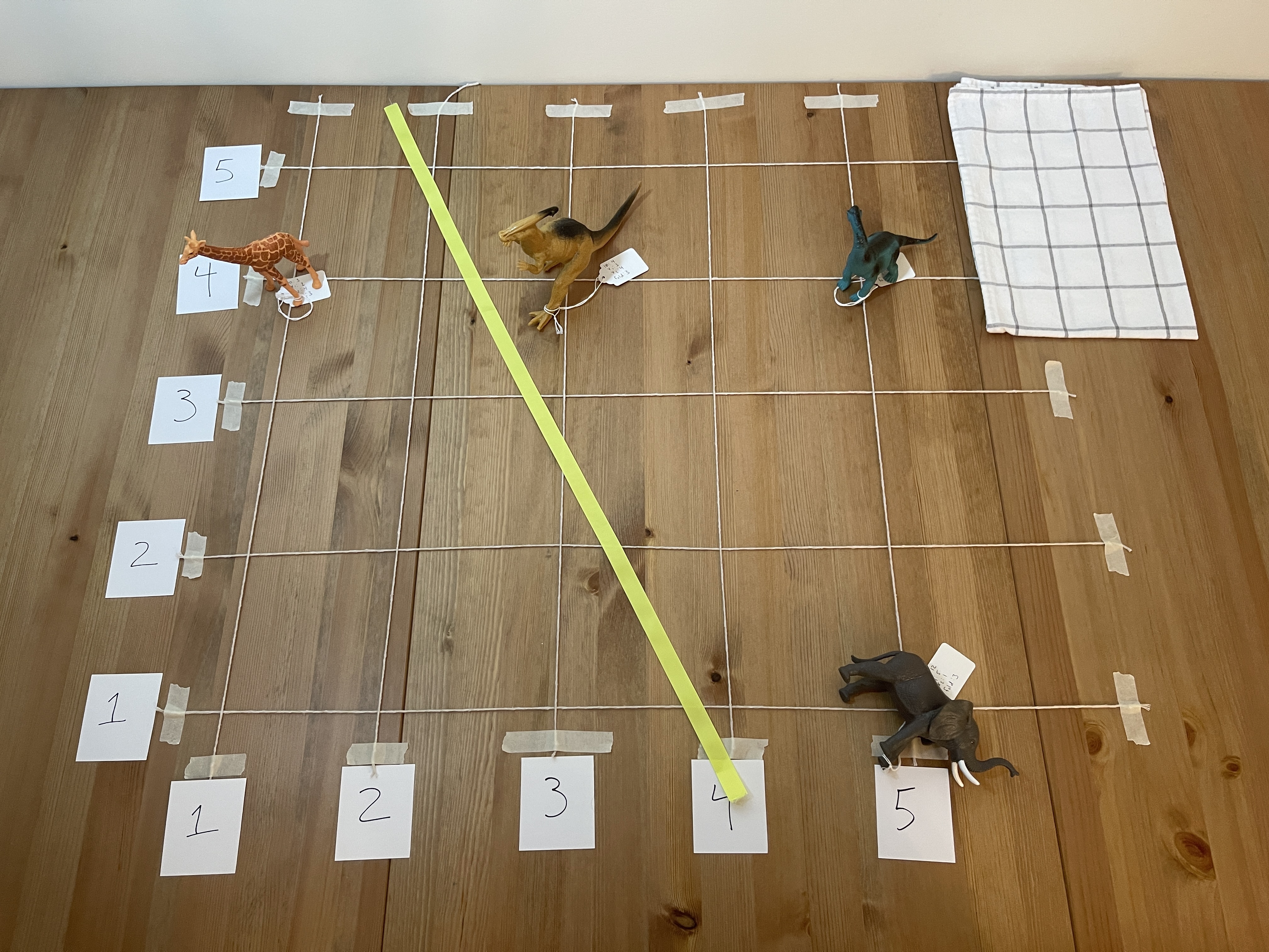
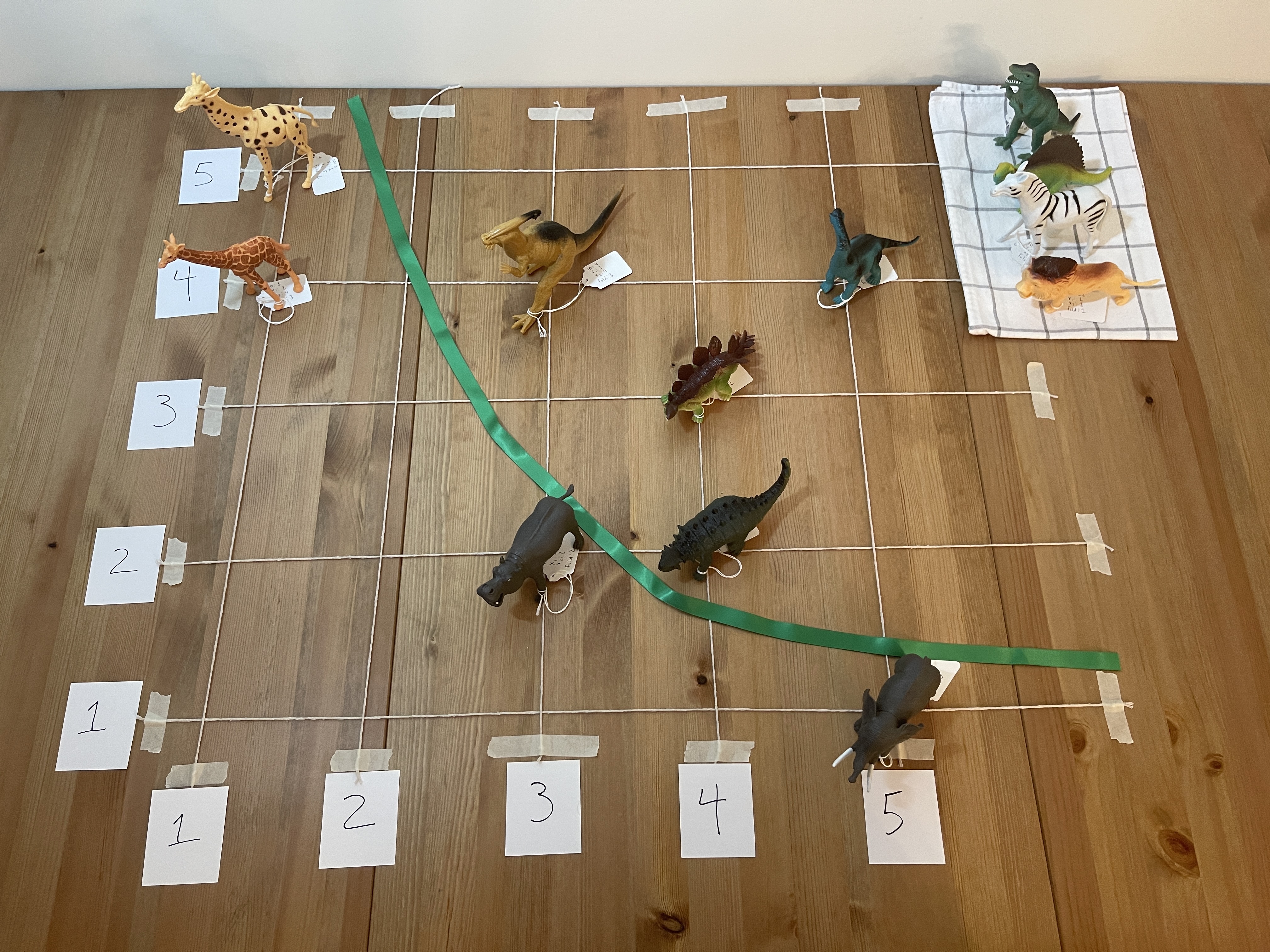
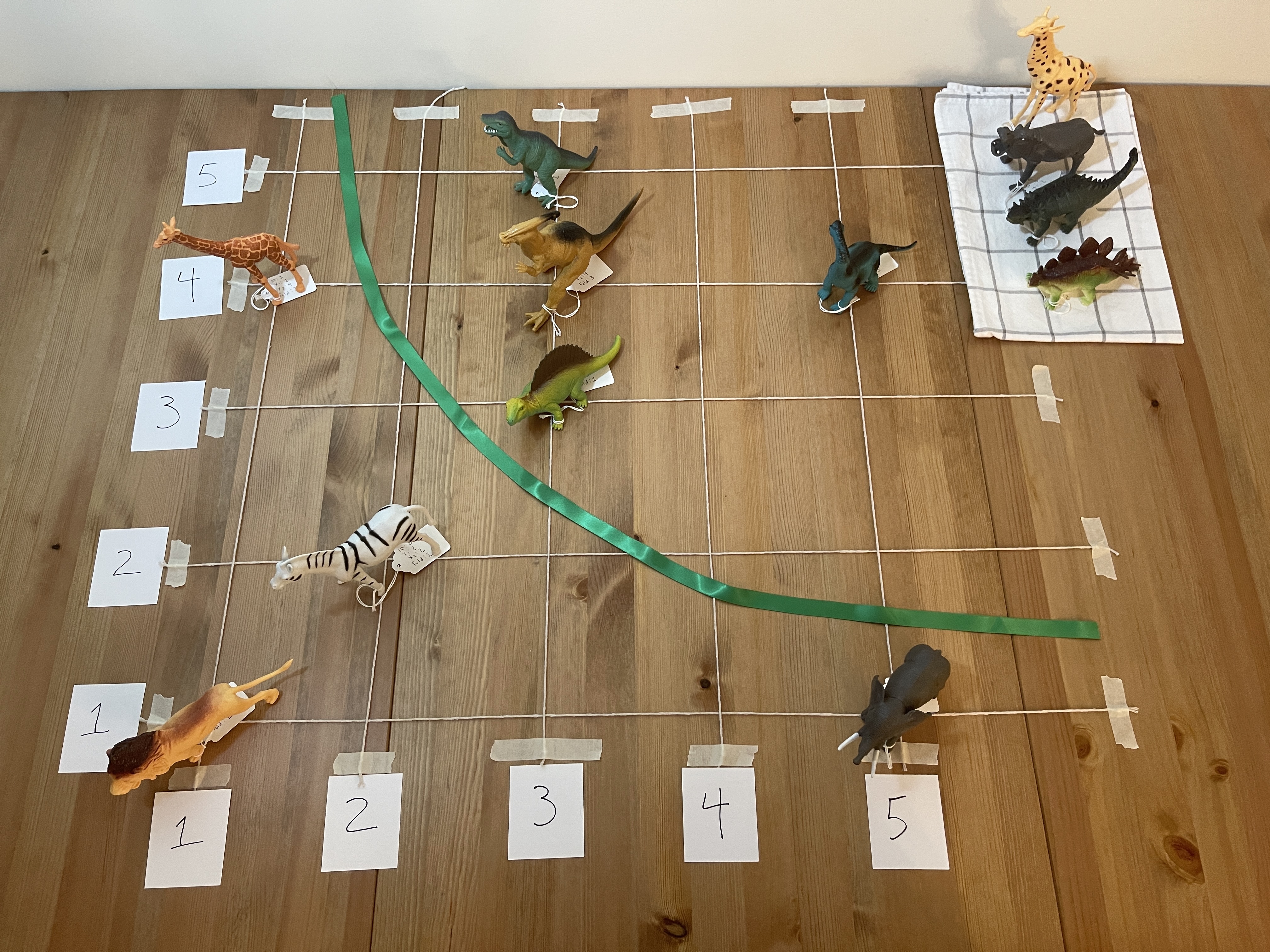
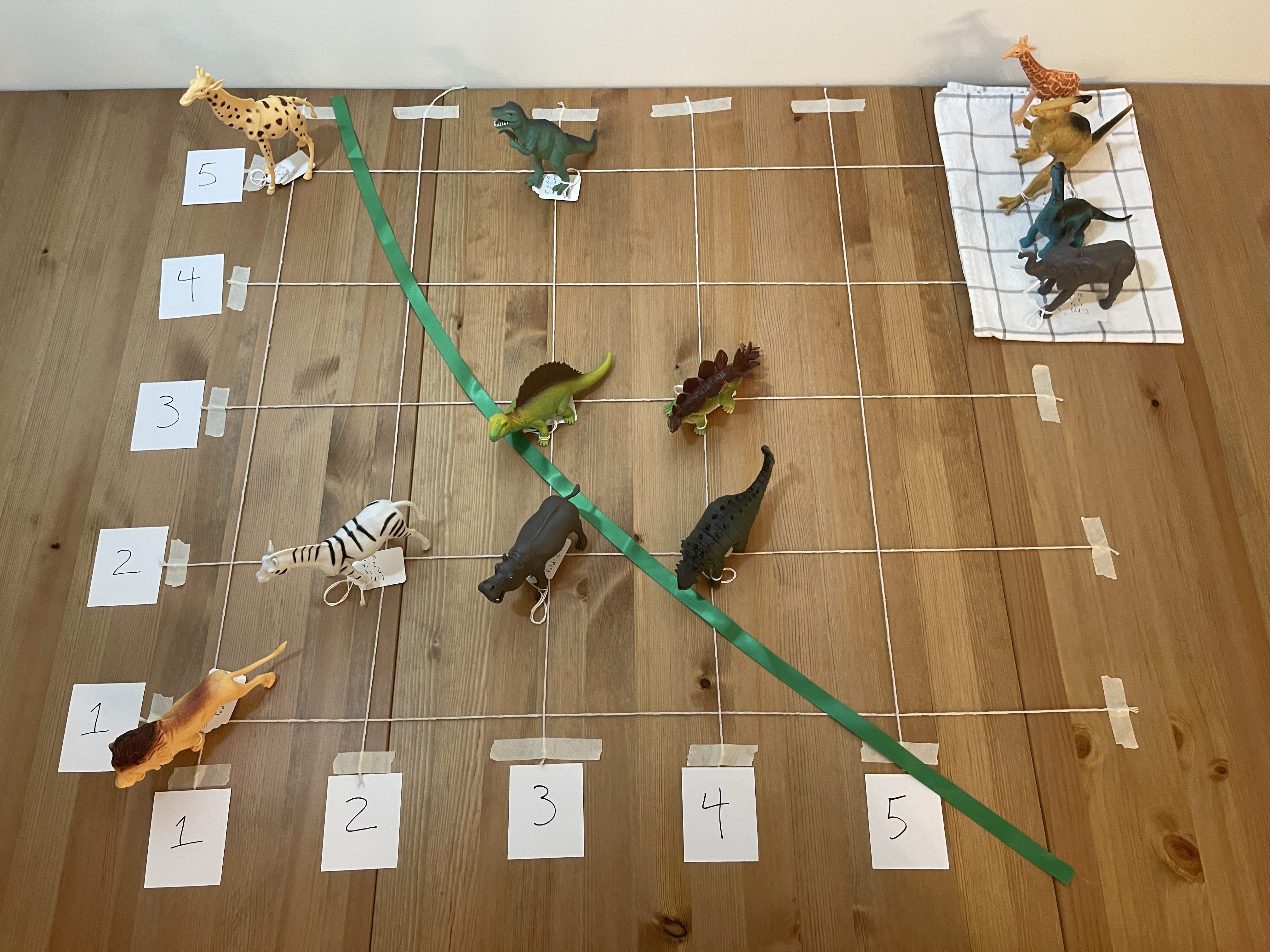
The following images show a graphic of the data and a picture of the toys in place. In the graphic, mammals are yellow while dinosaurs are green. The toys are in place based on their tag’s information. The tea towel holds the assessment data. People can just walk off the grid to any place in real life. For this blogpost, graphics on the left would be displayed during the presentation to guide the exercise, while the pictures on the right show the physical experience.
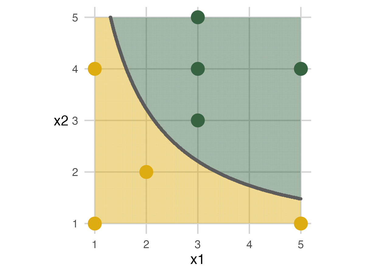
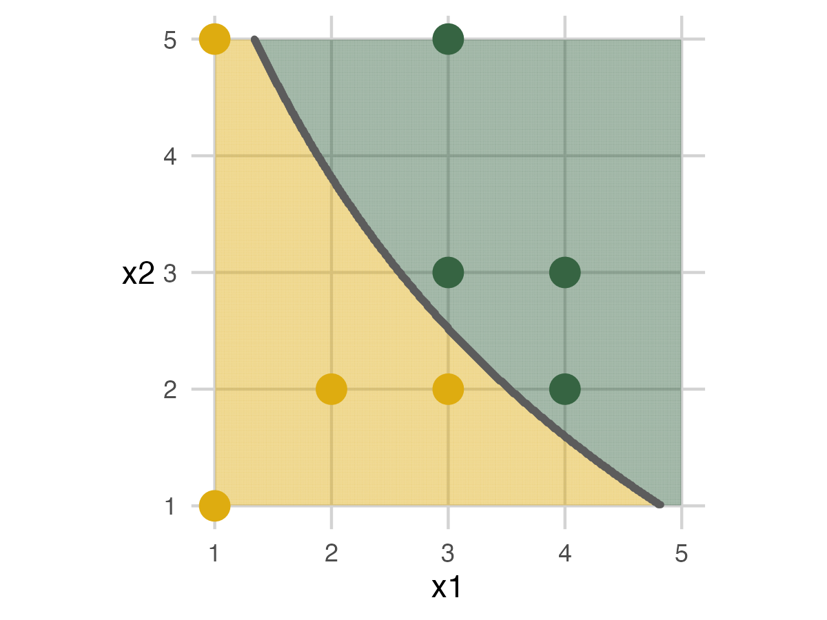
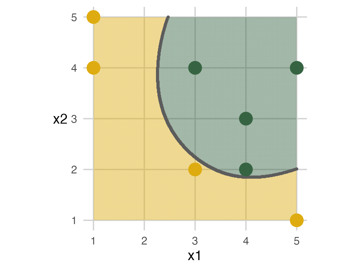
Folds and Models
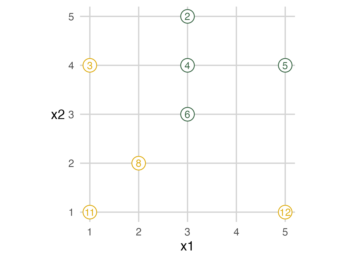
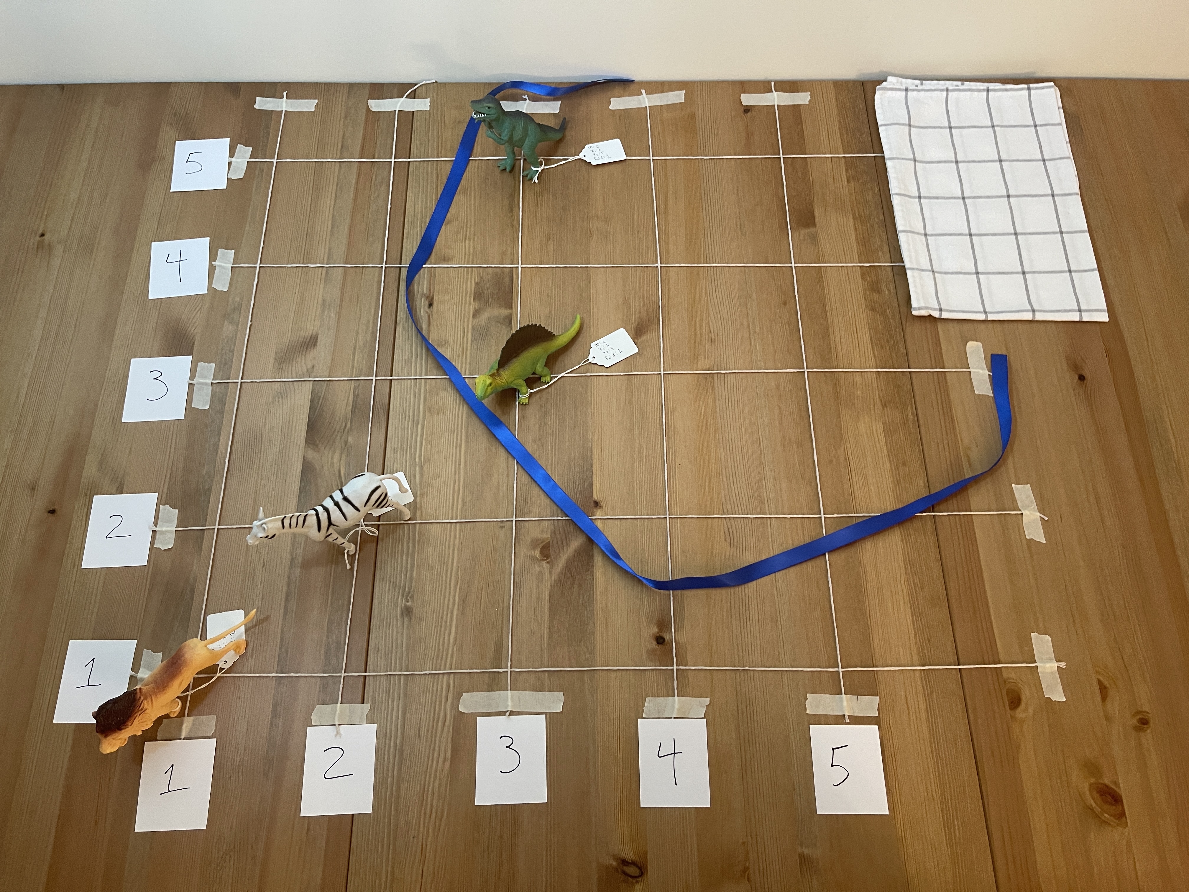
The next image shows which animals are in each fold. This image shows when people should move off the grid. The fold IDs are also on the tag attached to each toy.
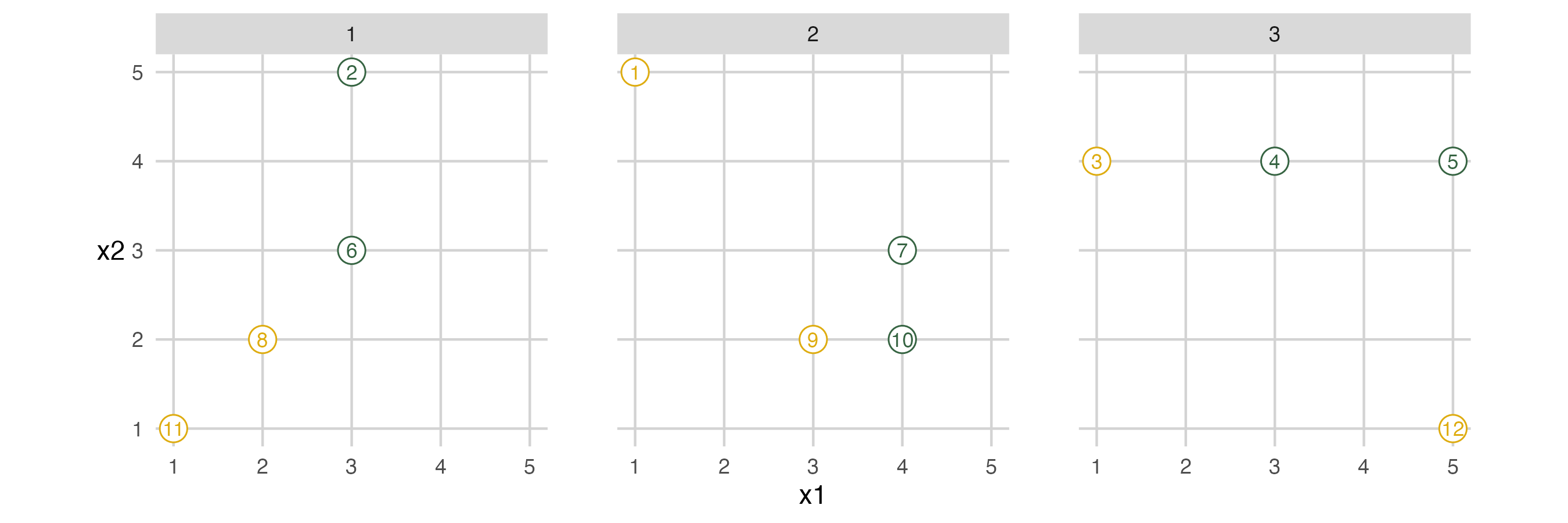
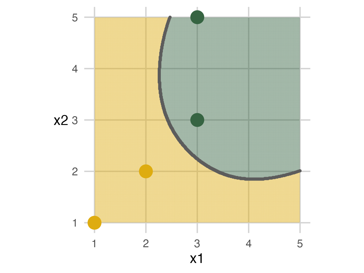
Fold 1
So to set up the first fold, people with a fold ID of 1 move off the grid. These people are in the assessment set while everyone else is in the analysis set. (Sometimes called validation and training set.)
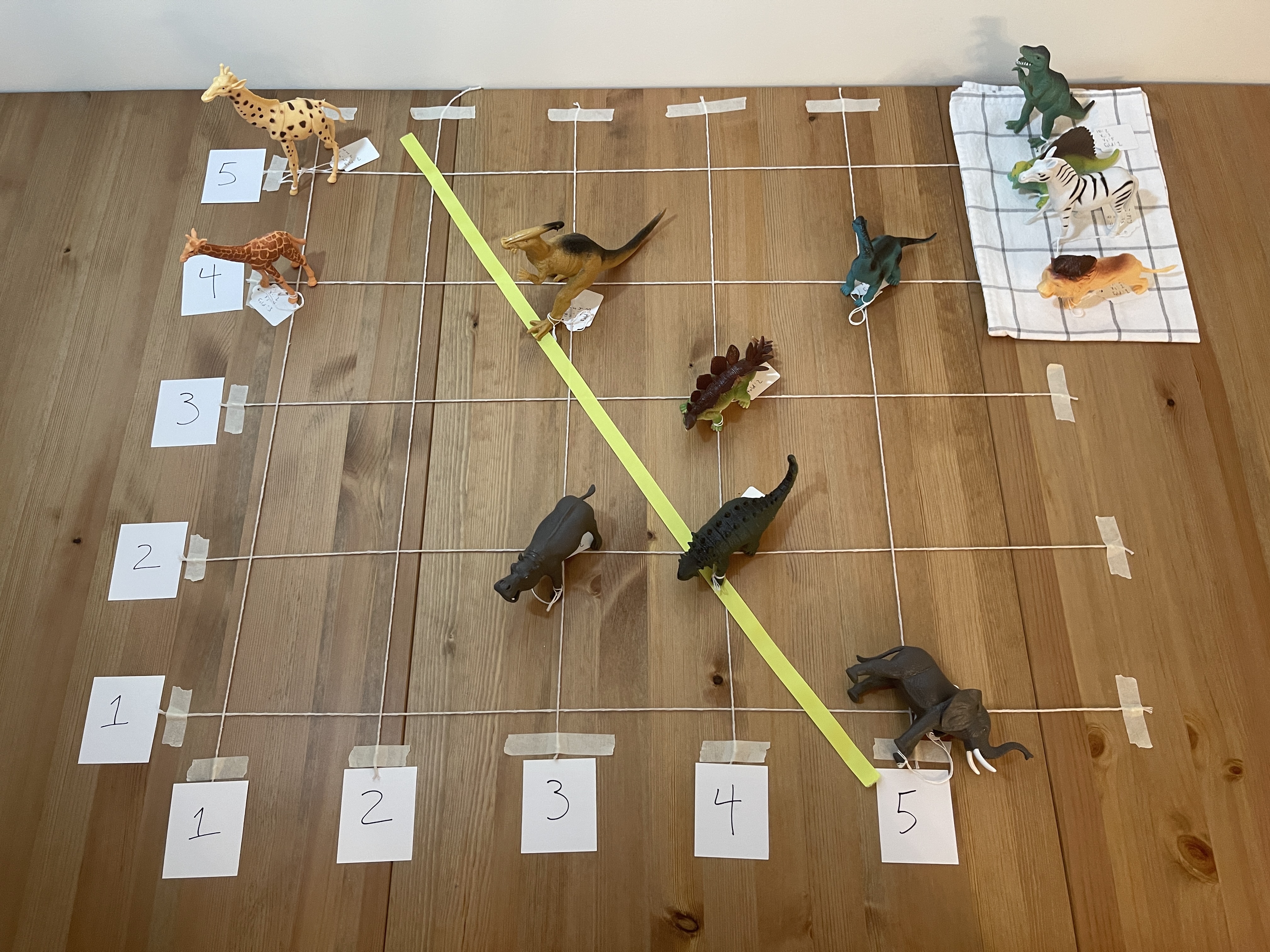
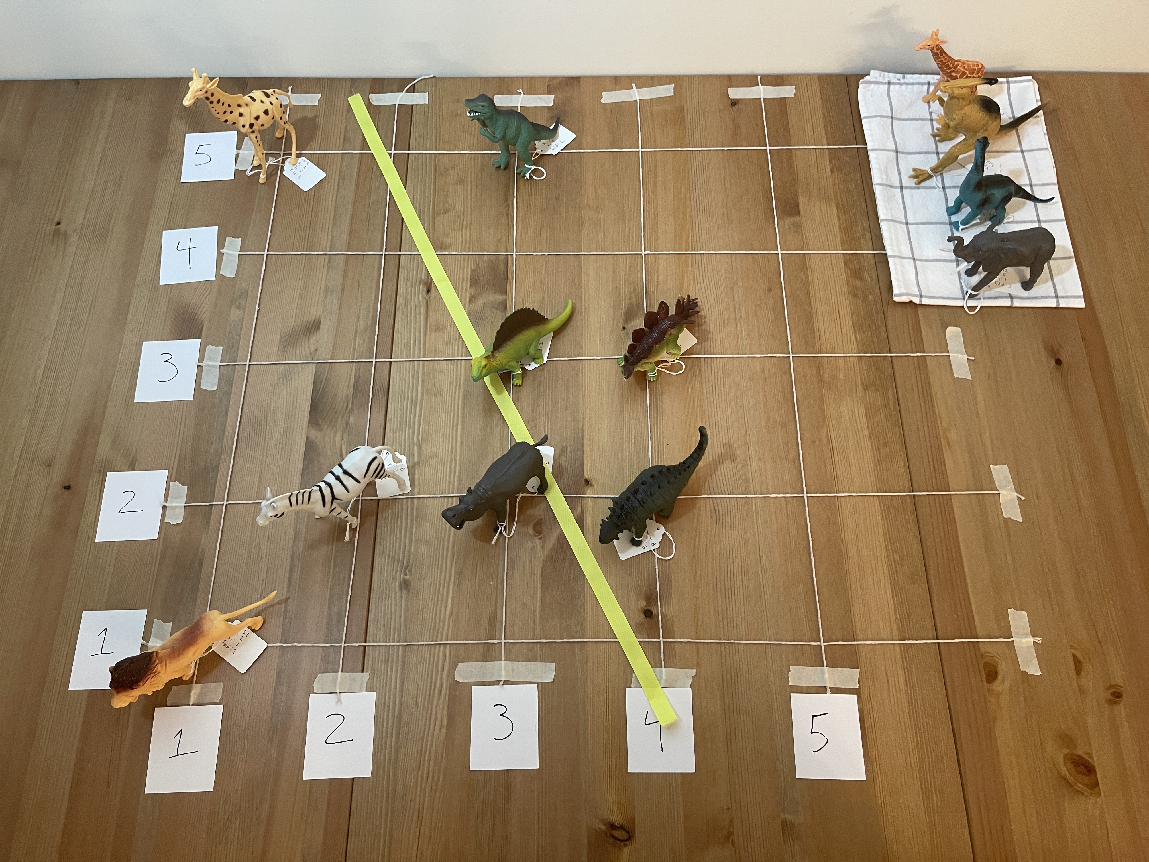
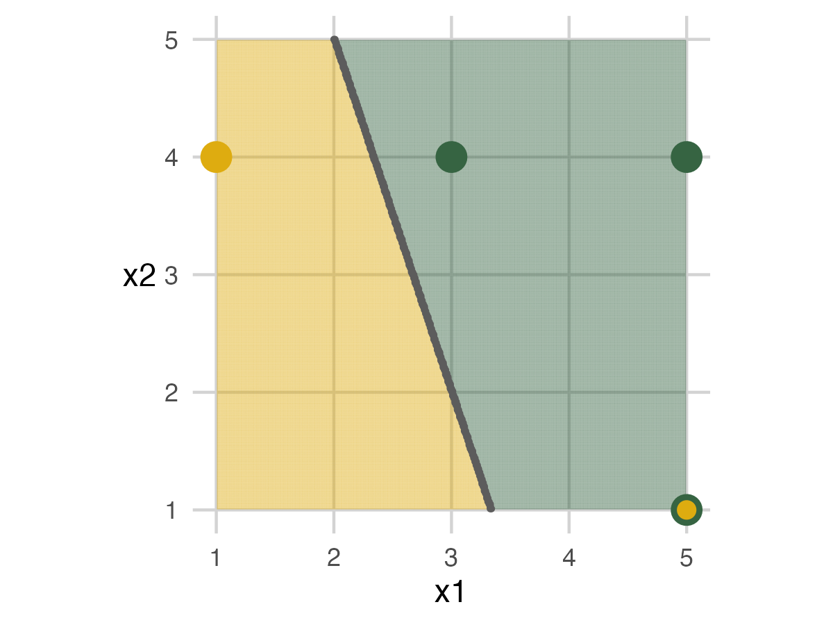
Fold 1 - Model 1
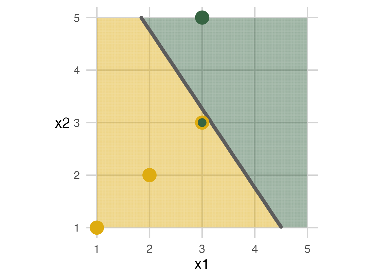
For Model 1, we have a piece of ribbon that stretches to a line across the grid. For this model, the ribbon is always a straight line. The analysis set people attempt to set the line down to separate the mammals from the dinosaurs. In this case, a straight line cannot separate the animals. So, the elephant in the bottom right corner ends up on the wrong side. The graphic displays the error with a green on the outside (labeled as a dinosaur) and yellow on the inside (actually a mammal) dot. For the graphics, dots with two colors are mismatches.
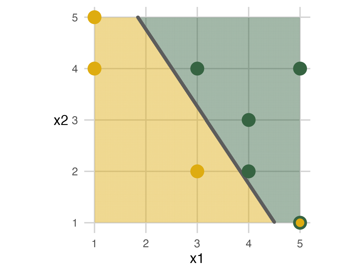
It’s important to emphasize the analysis set doesn’t know about the assessment set. This way, people don’t try to remember where they were to improve accuracy. Driving home this point really helped explain the importance of cross-validation and how it estimates model performance on unseen data.
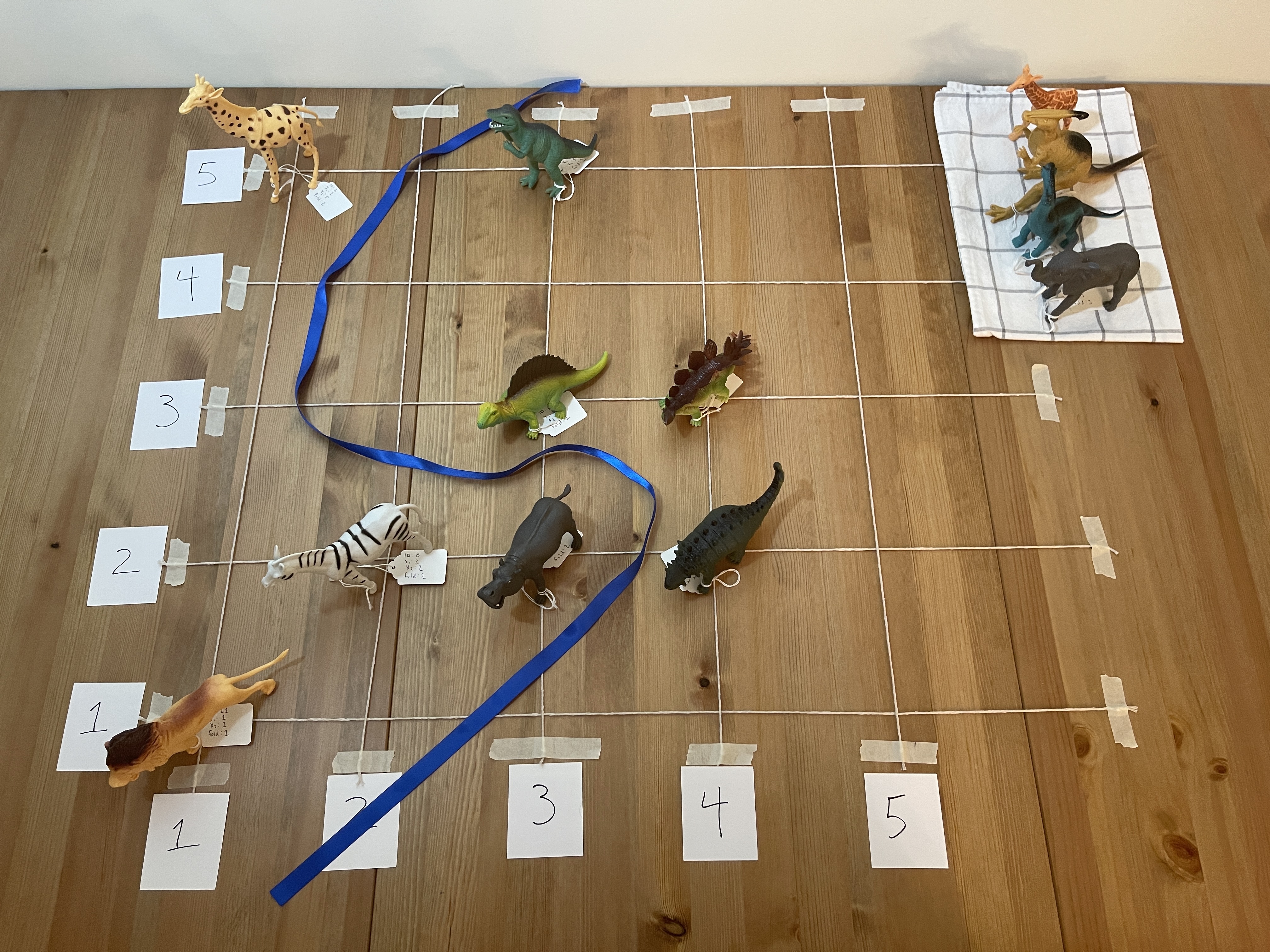
We bring the people in the hold-out area back onto the grid for the assessment set. The ribbon marking the model stays in place. For my presentation, I kept everyone on the grid. But for the pictures, it was easier to see the results by moving the analysis set out of the way. In the end, the model mislabels one of the dinosaurs because it’s on the wrong side. Its dot is two colors, and the toy is knocked over.
Fold 2
The people in fold 2 move off the grid for the next step. Then a straight line model is built.
Fold 2 - Model 1
In this example, the model built by code mismarks the dinosaur in the model. I choose to move the model and correct it for the picture. In an actual presentation, people will move these however they want. So they are unlikely to match the computer result every time. You can either keep track of both results or only focus on the computer output.
When we add back in the assessment set, two errors occur: the giraffe in the top left and a dinosaur towards the bottom right.
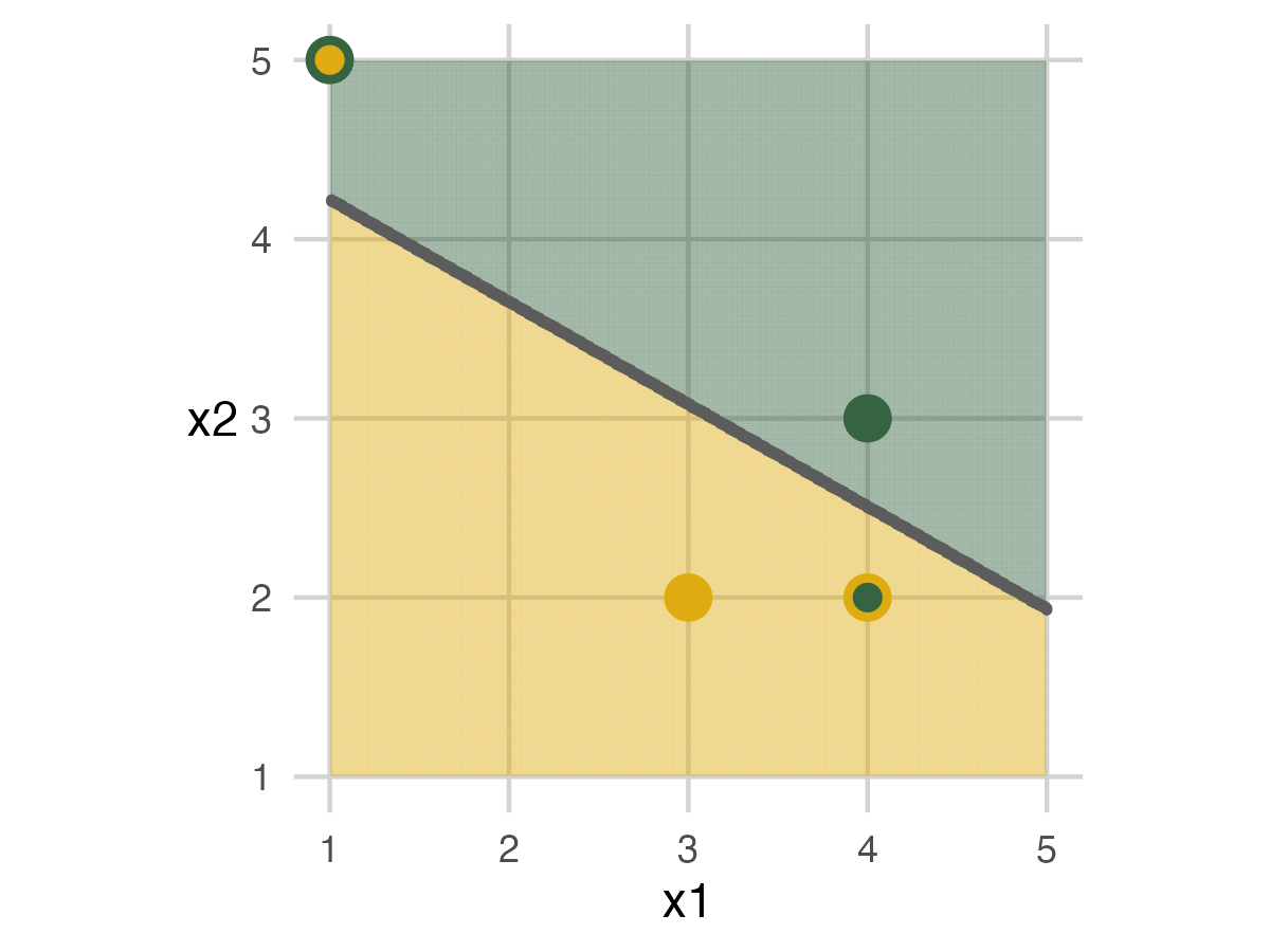
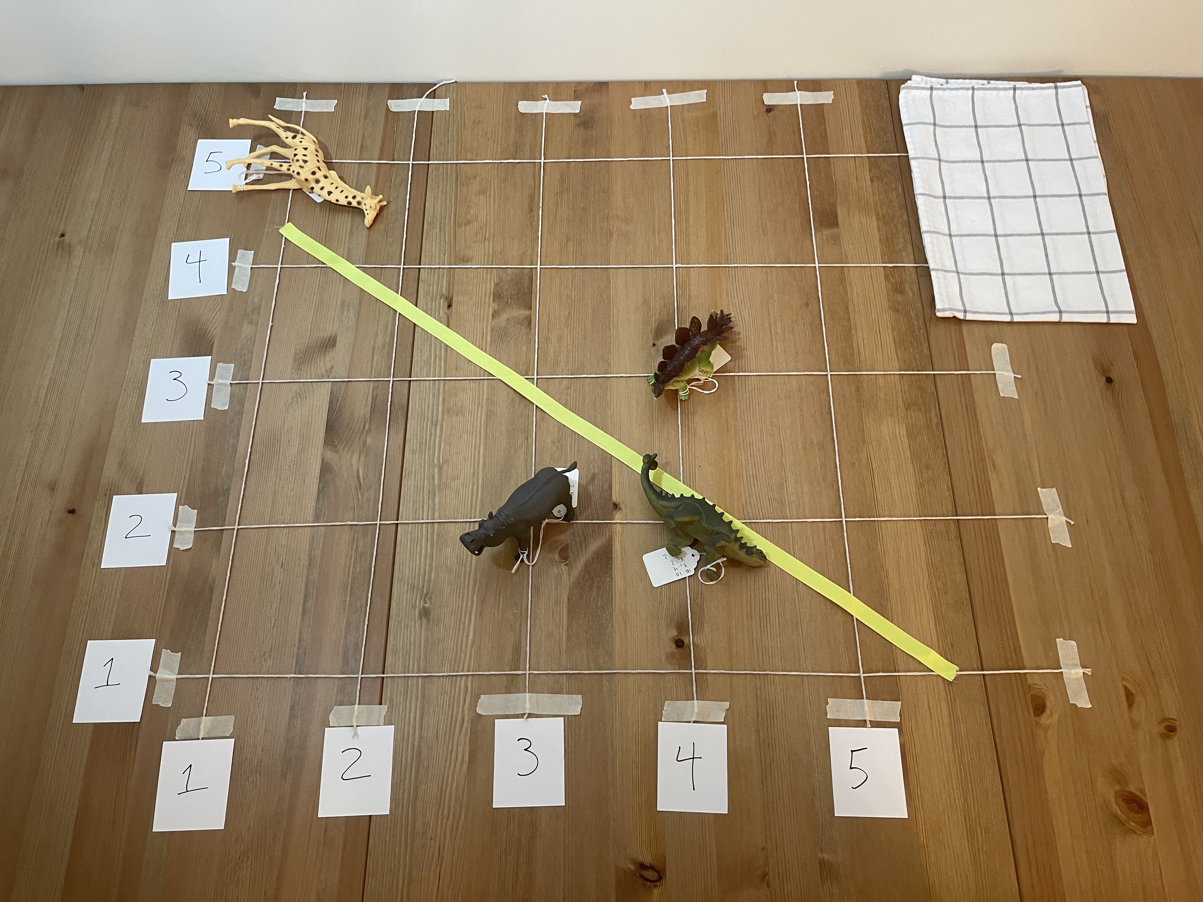
Fold 3
Fold 3 repeats the same action with the last set of people.
Fold 3 - Model 1
We end up building a model again. This time everyone in the analysis set can be labeled correctly, but we’ll miss the elephant in the bottom right of the assessment set.
Fold 1 - Model 2
This set will mirror the first part of the exercise but use a different model. The new model is a longer piece of ribbon that can have a slight curve. Apart from that, everything is the same.
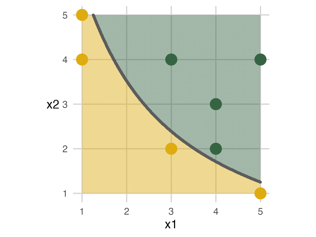
For fold 1, we finally get an analysis set and an assessment set with 100% accuracy. This shows that adding some complexity to the model can help.
Fold 2 - Model 2
This follows the same pattern as the previous fold.
Fold 3 - Model 2
In this fold, we do have an error in the assessment set. I like to see at least one error for each model to demonstrate that it can be impossible to get everything correct.
Fold 1 - Model 3
We have the longest ribbon for the most flexible model for the final model. The exercise follows the previous steps.

Fold 2 - Model 3
Fold 3 - Model 3
There is more room for the final model to move the ribbon. The flexibility can create new patterns that don’t capture the data as well.
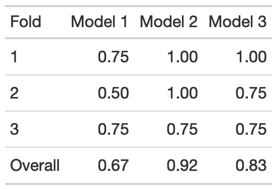
Overall Accuracy
We can wrap up the exercise by looking at the models’ overall accuracy. For this setup, Model 2 performed the best. This outcome shows that having some flexibility can fit the data better, but adding too much complexity to the model can hurt.
The last topic to mention is the toys used. I got African mammals and dinosaurs because they were at the store near me, but I think it’s a great combination. Most people know enough about them to have a conversation on variables that can help separate them. At the same time, it’s not a serious or business-related topic. So, it’s more interesting than just using colored points, but you can also avoid people getting too caught up in the weeds. Feel free to change it to whatever you want.