Cohesive Graphs

Connecting graphs throughout a document
Data Science
Published

March 1, 2022

When creating a set of related graphs, it’s crucial to get all the details to match. This way, your document (report, dashboard, presentation, etc.) is easy to follow, reduces the chance of confusion or mistakes, and generally looks better. This blog post covers significant features to double-check before submitting graphics to someone. This way, you can learn from my experience of getting it wrong, getting told it was wrong by end-users, and then fixing it.

I think this subject isn’t covered in many visualization courses because they tend to focus on one chart at a time. You can see this in a lot of infographics where they only feature one large detailed graphic. These are helpful for many settings but less useful in business scenarios. Large singular images can help you answer detailed questions on one subject. For example, a line chart of revenue by day can show the change from May 5th to June 7th or which Monday had the highest amount. So you end up with one big graph that answers a lot of small questions.

However, you probably need a lot of small charts that answer one big vague question, like “how’s this initiative going?” or “what’s the effect of a changing population?”. These questions don’t need detailed information on one metric but smoother information on several. When you have multiple metrics, you’ll end up with many graphs, and they’ll need to work together to answer the big question.

This post won’t cover how much detail to remove since that’s dependent on the situation (sometimes you do need daily data), but it will focus on smoothing out differences in a set of charts. I’ll cover colors, order, and text. The process is pretty similar to branding, and following advice on that (here and here) can help.

The graphs will appear side-by-side in the blog post but not in your actual document. So, there will be some redundancy (like having the legend in each one) on display. For each chart, imagine it’s multiple pages or clicks away from the other ones.


Color


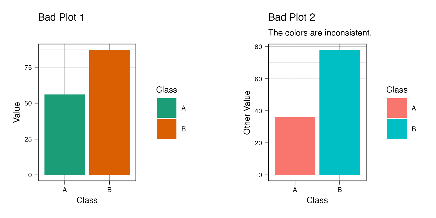
People like your colors to match across all your graphs. The colors could be for discrete groups (like purple and green for different subpopulations), continuous scales (blue for low and yellow for high amounts), or emphasis (red for highlighting concern). We’ll compare inconsistent graphs to those that match in the following examples.

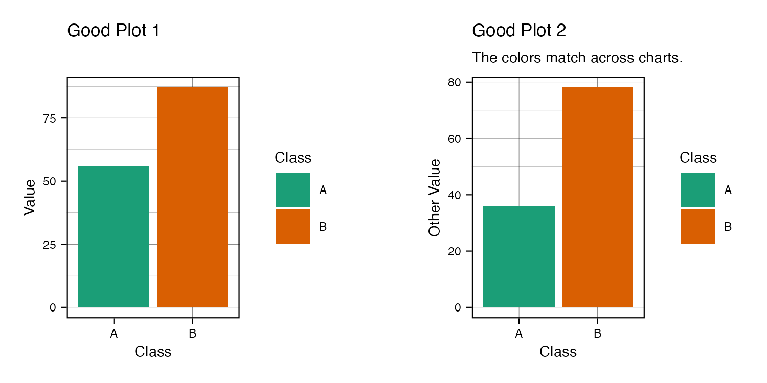
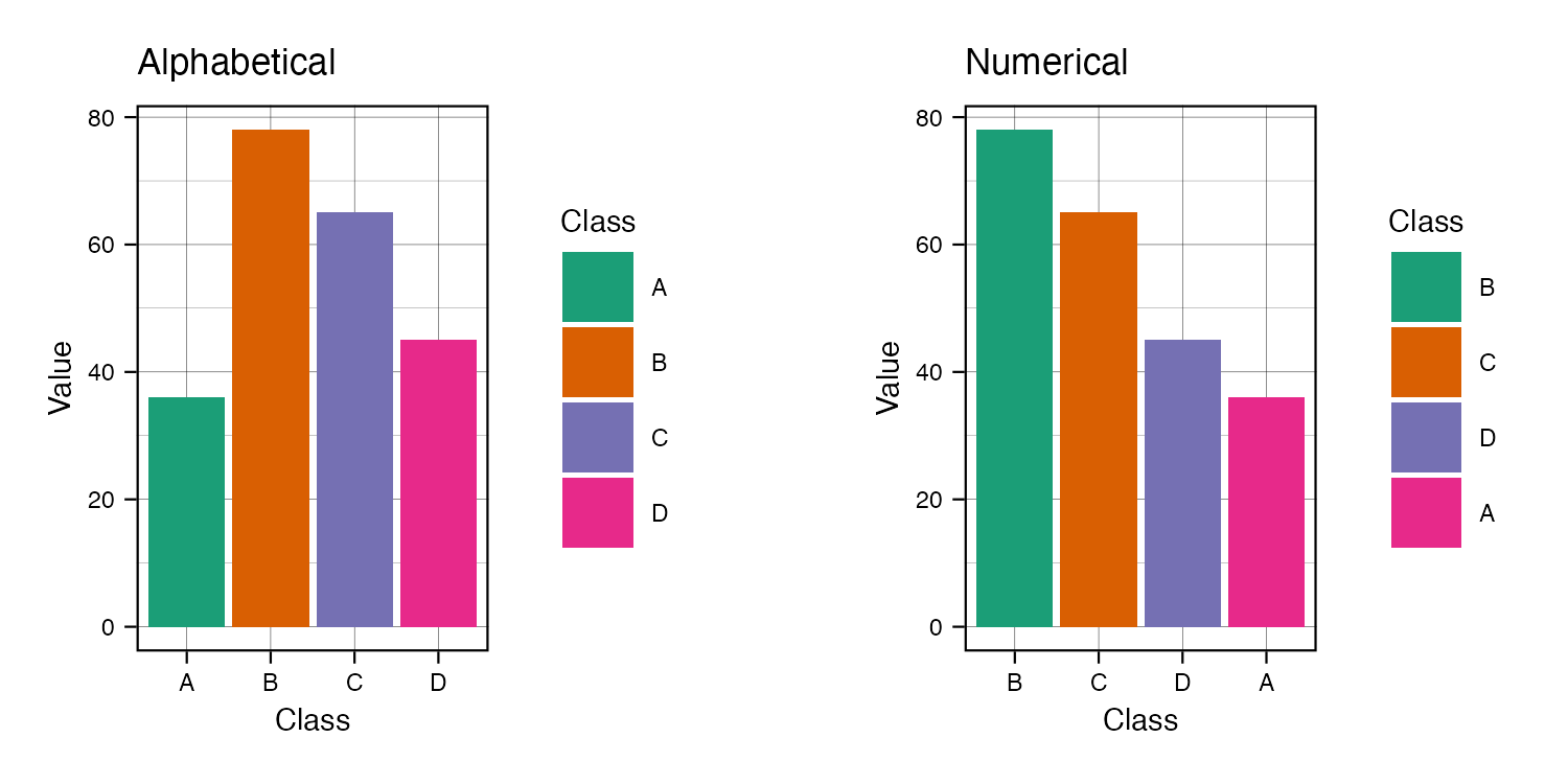
For discrete color matches across charts, make sure to use the same color for the same entity. In this example, classes A and B’s colors should be the same for all charts.

Bad plots with changing color

Good plots with consistent color


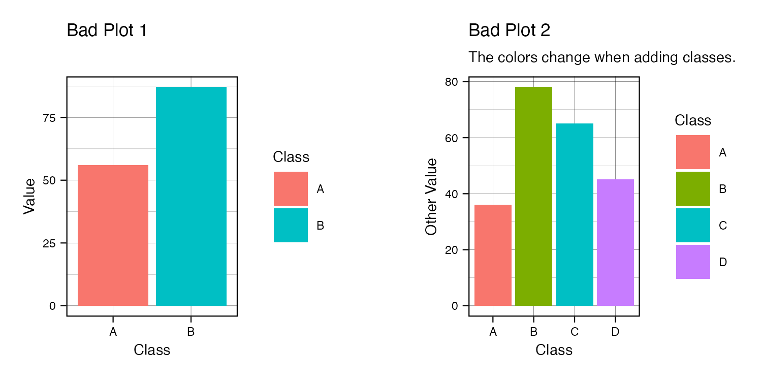
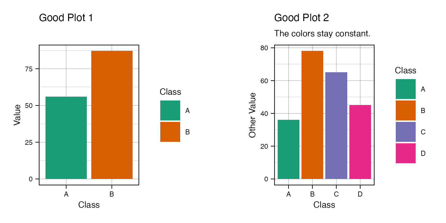
Adding new levels will often break the matching colors. Here Class B changes drastically.

Bad plots with changing color when adding new levels

Good plots with consistent color when adding new levels


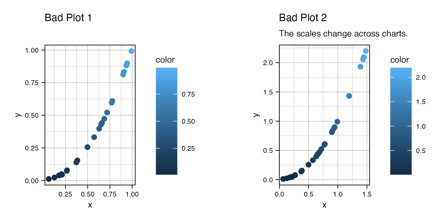
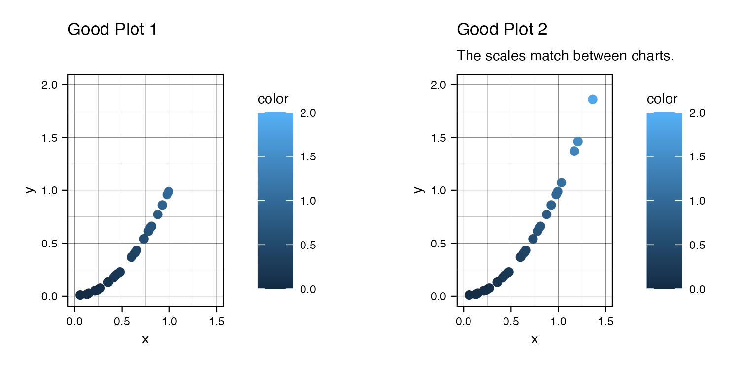
For continuous color (and other scales), ensure the limits match across charts. If the charts need to be comparable, the color limits (and other limits, like the x-axis range) should match.

Bad plots with changing color when expanding axes

Good plots with consistent color when expanding axes


This one is more of a judgment call than for discrete color. Sometimes you’ll want to focus on some detail, and having the broader limits won’t show that. So having different limits might be the better call as long as end-users can tell the differences quickly.
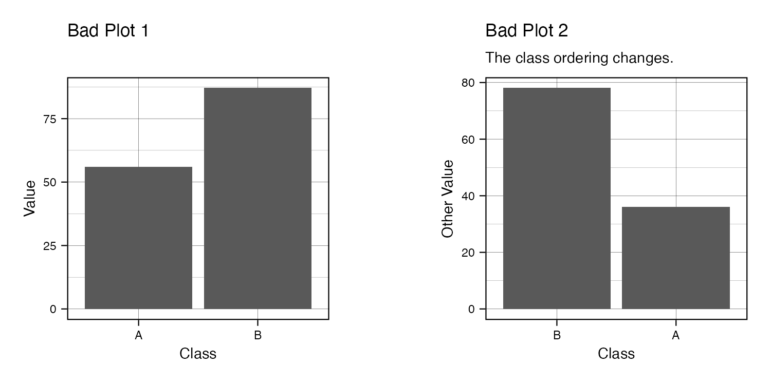
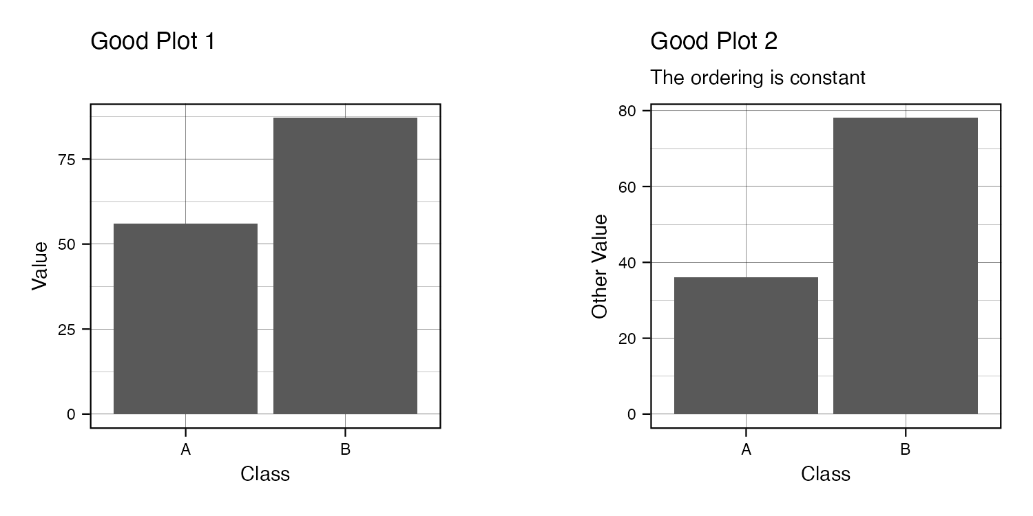


Order


Even if color is cohesive or unused, the order also needs to stick.

Bad plots with changing order

Good plots with consistent order


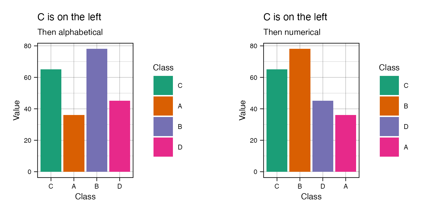
There are options for determining the order that might change across graphs. As long as it’s evident that the change occurred because of the ordering process and that the process is more important than consistency, it should be fine.

Order options

You can set the main entity first if it’s the most important or serves as a baseline.

Order options with base level C


Text


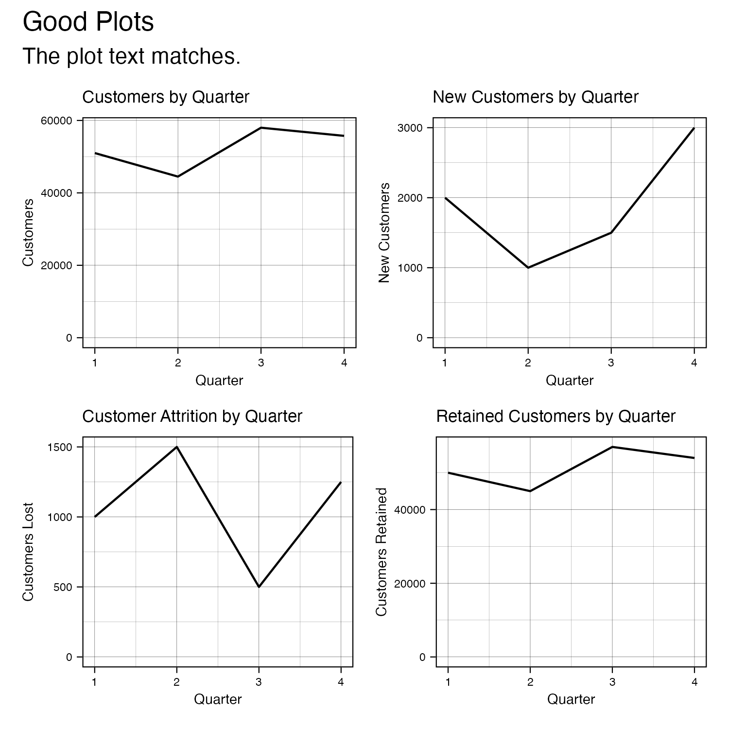
Finally, ensuring consistency of the text across graphs smooths out transitions and easily builds up a big picture. There are fewer minor differences to compare, so important ones stand out.

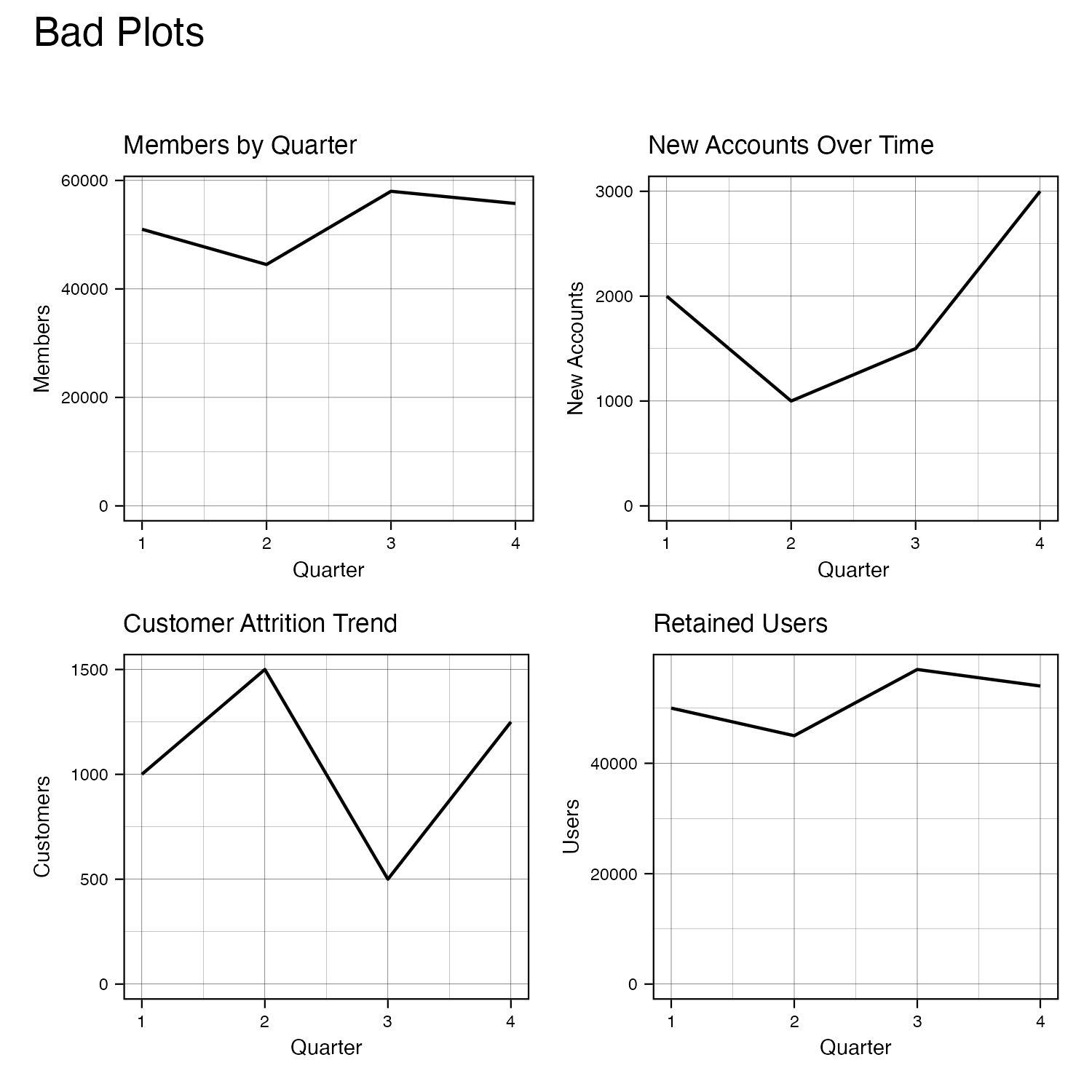
In the following example, titles contain synonyms for “Customers” and “by Quarter.” These might be incorrect if members, accounts, customers, and users are different, especially for various end-users. In addition, the disparity for “by Quarter” can add confusion if end-users believe there is a difference when there isn’t one. Having consistency in the graphs’ text reduces the cognitive load and makes focusing on what the charts are showing easy.

Bad plots with changing text

Good plots with consistent text

[Code]
library(tidyverse)
library(patchwork)

## Colors

# Color schemes
df <- data.frame(Class = c("A", "B"),
                 Value = c(56, 87))

plot_1 <- ggplot(data = df,
                 aes(Class, Value, fill = Class)) +
  geom_bar(stat = "identity") +
  scale_fill_brewer(palette = "Dark2") +
  labs(title = "Bad Plot 1") +
  theme_linedraw() +
  theme(text = element_text(size = 7))

df_next <- data.frame(Class = c("A", "B"),
                      Value = c(36, 78))

plot_2 <- ggplot(data = df_next,
                 aes(Class, Value, fill = Class)) +
  geom_bar(stat = "identity") +
  ylab("Other Value") +
  labs(title = "Bad Plot 2",
       subtitle = "The colors are inconsistent.") +
  theme_linedraw() +
  theme(text = element_text(size = 7))

plot_1 + plot_spacer() + plot_2 + plot_layout(widths = c(4, 1, 4))

ggsave("plot_1.png",
       width = 5,
       height = 2.5)

df <- data.frame(Class = c("A", "B"),
                 Value = c(56, 87))

plot_1 <- ggplot(data = df,
                 aes(Class, Value, fill = Class)) +
  geom_bar(stat = "identity") +
  scale_fill_brewer(palette = "Dark2") +
  labs(title = "Good Plot 1") +
  theme_linedraw() +
  theme(text = element_text(size = 7))

df_next <- data.frame(Class = c("A", "B"),
                      Value = c(36, 78))

plot_2 <- ggplot(data = df_next,
                 aes(Class, Value, fill = Class)) +
  geom_bar(stat = "identity") +
  scale_fill_brewer(palette = "Dark2") +
  ylab("Other Value") +
  labs(title = "Good Plot 2",
       subtitle = "The colors match across charts.") +
  theme_linedraw() +
  theme(text = element_text(size = 7))

plot_1 + plot_spacer() + plot_2 + plot_layout(widths = c(4, 1, 4))

ggsave("plot_2.png",
       width = 5,
       height = 2.5)

# Adding new level
df <- data.frame(Class = c("A", "B"),
                 Value = c(56, 87))

plot_1 <- ggplot(data = df,
       aes(Class, Value, fill = Class)) +
  geom_bar(stat = "identity") +
  labs(title = "Bad Plot 1") +
  theme_linedraw() +
  theme(text = element_text(size = 7))

df_next <- data.frame(Class = c("A", "B", "C", "D"),
                 Value = c(36, 78, 65, 45))

plot_2 <- ggplot(data = df_next,
       aes(Class, Value, fill = Class)) +
  geom_bar(stat = "identity") +
  ylab("Other Value") +
  labs(title = "Bad Plot 2",
       subtitle = "The colors change when adding classes.") +
  theme_linedraw() +
  theme(text = element_text(size = 7))

plot_1 + plot_spacer() + plot_2 + plot_layout(widths = c(4, 1, 4))

ggsave("plot_3.png",
       width = 5,
       height = 2.5)

df <- data.frame(Class = c("A", "B"),
                 Value = c(56, 87))

plot_1 <- ggplot(data = df,
                 aes(Class, Value, fill = Class)) +
  geom_bar(stat = "identity") +
  scale_fill_brewer(palette = "Dark2") +
  labs(title = "Good Plot 1") +
  theme_linedraw() +
  theme(text = element_text(size = 7))

df_next <- data.frame(Class = c("A", "B", "C", "D"),
                      Value = c(36, 78, 65, 45))

plot_2 <- ggplot(data = df_next,
                 aes(Class, Value, fill = Class)) +
  geom_bar(stat = "identity") +
  scale_fill_brewer(palette = "Dark2") +
  ylab("Other Value") +
  labs(title = "Good Plot 2",
       subtitle = "The colors stay constant.") +
  theme_linedraw() +
  theme(text = element_text(size = 7))

plot_1 + plot_spacer() + plot_2 + plot_layout(widths = c(4, 1, 4))

ggsave("plot_4.png",
       width = 5,
       height = 2.5)

# increasing/decreasing scales across graphs
set.seed(1)
df <- data.frame(x = runif(25, 0, 1)) %>%
  mutate(y = x^2 + runif(25, 0, .01),
         color = x^2 + runif(25, 0, .01))

plot_1 <- ggplot(data = df,
       aes(x, y, color = color)) +
  geom_point() +
  labs(title = "Bad Plot 1") +
  theme_linedraw() +
  theme(text = element_text(size = 7))

df_next <- data.frame(x = runif(5, 1, 1.5)) %>%
  mutate(y = x^2 + runif(5, 0, .01),
         color = x^2 + runif(5, 0, .01)) %>%
  rbind(df)

plot_2 <- ggplot(data = df_next,
                 aes(x, y, color = color)) +
  geom_point() +
  labs(title = "Bad Plot 2",
       subtitle = "The scales change across charts.") +
  theme_linedraw() +
  theme(text = element_text(size = 7))

plot_1 + plot_spacer() + plot_2 + plot_layout(widths = c(4, 1, 4))

ggsave("plot_5.png",
       width = 5,
       height = 2.5)

df <- data.frame(x = runif(25, 0, 1)) %>%
  mutate(y = x^2 + runif(25, 0, .01),
         color = x^2 + runif(25, 0, .01))

plot_1 <- ggplot(data = df,
                 aes(x, y, color = color)) +
  geom_point() + 
  scale_x_continuous(limits = c(0, 1.5)) +
  scale_y_continuous(limits = c(0, 2)) +
  scale_color_continuous(limits = c(0, 2)) +
  labs(title = "Good Plot 1") +
  theme_linedraw() +
  theme(text = element_text(size = 7))

df_next <- data.frame(x = runif(5, 1, 1.5)) %>%
  mutate(y = x^2 + runif(5, 0, .01),
         color = x^2 + runif(5, 0, .01)) %>%
  rbind(df)

plot_2 <- ggplot(data = df_next,
                 aes(x, y, color = color)) +
  geom_point() + 
  scale_x_continuous(limits = c(0, 1.5)) +
  scale_y_continuous(limits = c(0, 2)) +
  scale_color_continuous(limits = c(0, 2)) +
  labs(title = "Good Plot 2",
       subtitle = "The scales match between charts.") +
  theme_linedraw() +
  theme(text = element_text(size = 7))

plot_1 + plot_spacer() + plot_2 + plot_layout(widths = c(4, 1, 4))

ggsave("plot_6.png",
       width = 5,
       height = 2.5)

## Category Order
# same order across graphs
df <- data.frame(Class = c("A", "B"),
                 Value = c(56, 87))

plot_1 <- ggplot(data = df,
                 aes(Class, Value)) +
  geom_bar(stat = "identity") +
  labs(title = "Bad Plot 1") +
  theme_linedraw() +
  theme(text = element_text(size = 7))

df_next <- data.frame(Class = c("A", "B"),
                      Value = c(36, 78)) %>%
  mutate(Class = factor(Class, levels = c("B", "A")))

plot_2 <- ggplot(data = df_next,
                 aes(Class, Value)) +
  geom_bar(stat = "identity") +
  ylab("Other Value") +
  labs(title = "Bad Plot 2",
       subtitle = "The class ordering changes.") +
  theme_linedraw() +
  theme(text = element_text(size = 7))

plot_1 + plot_spacer() + plot_2 + plot_layout(widths = c(4, 1, 4))

ggsave("plot_7.png",
       width = 5,
       height = 2.5)

df <- data.frame(Class = c("A", "B"),
                 Value = c(56, 87))

plot_1 <- ggplot(data = df,
                 aes(Class, Value)) +
  geom_bar(stat = "identity") +
  labs(title = "Good Plot 1") +
  theme_linedraw() +
  theme(text = element_text(size = 7))

df_next <- data.frame(Class = c("A", "B"),
                      Value = c(36, 78))

plot_2 <- ggplot(data = df_next,
                 aes(Class, Value)) +
  geom_bar(stat = "identity") +
  ylab("Other Value") +
  labs(title = "Good Plot 2",
       subtitle = "The ordering is constant") +
  theme_linedraw() +
  theme(text = element_text(size = 7))

plot_1 + plot_spacer() + plot_2 + plot_layout(widths = c(4, 1, 4))

ggsave("plot_8.png",
       width = 5,
       height = 2.5)

# Numeric (Values) vs Alphabet vs Importance
df <- data.frame(Class = c("A", "B", "C", "D"),
                      Value = c(36, 78, 65, 45))

plot_1 <- ggplot(data = df,
                 aes(Class, Value, fill = Class)) +
  geom_bar(stat = "identity") +
  scale_fill_brewer(palette = "Dark2") +
  labs(title = "Alphabetical") +
  theme_linedraw() +
  theme(text = element_text(size = 7))

df <- df %>%
  mutate(Class = fct_reorder(Class, Value, .desc = TRUE))

plot_2 <- ggplot(data = df,
                 aes(Class, Value, fill = Class)) +
  geom_bar(stat = "identity") +
  scale_fill_brewer(palette = "Dark2") +
  labs(title = "Numerical") +
  theme_linedraw() +
  theme(text = element_text(size = 7))

plot_1 + plot_spacer() + plot_2 + plot_layout(widths = c(4, 1, 4))

ggsave("plot_9.png",
       width = 5,
       height = 2.5)

df <- df %>%
  mutate(Class = factor(Class, c("A", "B", "C", "D"))) %>%
  mutate(Class = relevel(Class, "C"))

plot_1 <- ggplot(data = df,
                 aes(Class, Value, fill = Class)) +
  geom_bar(stat = "identity") +
  scale_fill_brewer(palette = "Dark2") +
  labs(title = "C is on the left",
       subtitle = "Then alphabetical") +
  theme_linedraw() +
  theme(text = element_text(size = 7))

df <- df %>%
  mutate(Class = fct_reorder(Class, Value, .desc = TRUE)) %>%
  mutate(Class = relevel(Class, "C"))

plot_2 <- ggplot(data = df,
                 aes(Class, Value, fill = Class)) +
  geom_bar(stat = "identity") +
  scale_fill_brewer(palette = "Dark2") +
  labs(title = "C is on the left",
       subtitle = "Then numerical") +
  theme_linedraw() +
  theme(text = element_text(size = 7))

plot_1 + plot_spacer() + plot_2 + plot_layout(widths = c(4, 1, 4))

ggsave("plot_10.png",
       width = 5,
       height = 2.5)

## Text
df <- data.frame(Quarter = c(1, 2, 3, 4),
                 New = c(2000, 1000, 1500, 3000),
                 Left = c(1000, 1500, 500, 1250),
                 Stayed = c(50000, 45000, 57000, 54000)) %>%
  mutate(Total = Stayed + New - Left)

plot_1 <- ggplot(data = df,
       aes(Quarter, Total)) +
  geom_line() +
  expand_limits(y = 0) +
  labs(title = "Members by Quarter") +
  ylab("Members") +
  theme_linedraw() +
  theme(text = element_text(size = 7))

plot_2 <- ggplot(data = df,
                 aes(Quarter, New)) +
  geom_line() +
  expand_limits(y = 0) +
  labs(title = "New Accounts Over Time") +
  ylab("New Accounts") +
  theme_linedraw() +
  theme(text = element_text(size = 7))

plot_3 <- ggplot(data = df,
                 aes(Quarter, Left)) +
  geom_line() +
  expand_limits(y = 0) +
  labs(title = "Customer Attrition Trend") +
  ylab("Customers") +
  theme_linedraw() +
  theme(text = element_text(size = 7))

plot_4 <- ggplot(data = df,
                 aes(Quarter, Stayed)) +
  geom_line() +
  expand_limits(y = 0) +
  labs(title = "Retained Users") +
  ylab("Users") +
  theme_linedraw() +
  theme(text = element_text(size = 7))

(plot_1 + plot_2) / (plot_3 + plot_4) +
  plot_annotation(title = "Bad Plots",
                  subtitle = "")

ggsave("plot_11.png",
       width = 5,
       height = 5)

plot_1 <- ggplot(data = df,
                 aes(Quarter, Total)) +
  geom_line() +
  expand_limits(y = 0) +
  labs(title = "Customers by Quarter") +
  ylab("Customers") +
  theme_linedraw() +
  theme(text = element_text(size = 7))

plot_2 <- ggplot(data = df,
                 aes(Quarter, New)) +
  geom_line() +
  expand_limits(y = 0) +
  labs(title = "New Customers by Quarter") +
  ylab("New Customers") +
  theme_linedraw() +
  theme(text = element_text(size = 7))

plot_3 <- ggplot(data = df,
                 aes(Quarter, Left)) +
  geom_line() +
  expand_limits(y = 0) +
  labs(title = "Customer Attrition by Quarter") +
  ylab("Customers Lost") +
  theme_linedraw() +
  theme(text = element_text(size = 7))

plot_4 <- ggplot(data = df,
                 aes(Quarter, Stayed)) +
  geom_line() +
  expand_limits(y = 0) +
  labs(title = "Retained Customers by Quarter") +
  ylab("Customers Retained") +
  theme_linedraw() +
  theme(text = element_text(size = 7))

(plot_1 + plot_2) / (plot_3 + plot_4) +
  plot_annotation(title = "Good Plots",
                  subtitle = "The plot text matches.")

ggsave("plot_12.png",
       width = 5,
       height = 5)