##---------
# Libraries
##---------
library(tidyverse)
library(patchwork)
library(colorspace)This blog post talks about selecting colors nearby to a chosen one. This color selection process is needed for a generative art project I’m programming. For some background, I’m using the HCL color space. I’m not going to go into a lot of details on HCL for this post. You only need to HCL specifies unique colors by Hue, Chroma, and Luminance using polar coordinates. Hue, degrees around the circle, determines the location on the color wheel (like red, blue, green). Chroma, the distance from the circle’s center, specifies how much color is involved ranging from gray in the center to intense shades at the edges. Luminance is the brightness and ranges from 0 for black and 100 for white along the z-axis. Playing around hclwizard color picker (here) will help your understanding of how the parameters work. Lastly, this color space is perceptually uniform, so moving one unit distance in any direction gives colors that look about the same difference. More details can be found here and here.
Now for the R code
These libraries set up data manipulation, combining graphs, and using the HCL color space.
We’ll set up some code to get a green base color based on H, C, and L. We’ll also create a data set called color_points. This will only have one observation for right now, but we will add in more rows later. It’ll serve as a placeholder for functions that graph different shapes.
##------------
# Pick a color
##------------
H_point <- 112
C_point <- 60
L_point <- 68

color_hex <- hcl(H_point,
                 C_point,
                 L_point,
                 fixup = FALSE)

color_points <- data.frame(x = C_point * cos(H_point * pi/180),
                           y = C_point * sin(H_point * pi/180),
                           z = L_point,
                           H = H_point,
                           C = C_point,
                           L = L_point,
                           color_value = color_hex,
                           perpendicular_from_C_L = 0,
                           parallel_along_C_L = 0,
                           row_value = 0,
                           col_value = 0)
Let’s see where this base color exists in the HCL color space and create some helper functions.
We’ll start with looking at the Chroma-Luminance plane (C-L Plane). We want to graph slicing the HCL color space in half from top to bottom along the line H = 112. (H_point = 112)
##--------------------------------
# See color in H, C, L color space
##--------------------------------
# C-L Plane ----
get_C_L_plane <- function(H_point) {
  expand_grid(H = H_point,
              C = seq(0, 180, .5),
              L = seq(1, 100, .5)) %>%
    mutate(color_value = hcl(H, C, L, fixup = FALSE)) %>%
    filter(!is.na(color_value))
}
C_L_plane <- get_C_L_plane(H_point)

graph_C_L_plane <- function(C_L_plane, color_points, color_hex) {
  ggplot() +
    geom_point(data = C_L_plane,
               aes(C, L, color = color_value, fill = color_value)) +
    geom_point(data = color_points,
               aes(C, L, color = "white", fill = "white")) +
    scale_x_continuous(labels = abs) +
    scale_color_identity() +
    scale_fill_identity() +
    geom_point(aes(x = C_point,
                   y = L_point),
               color = 'black',
               fill = color_hex,
               shape = 21,
               size = 2) +
    coord_equal()
}
graph_C_L_plane(C_L_plane, color_points, color_hex)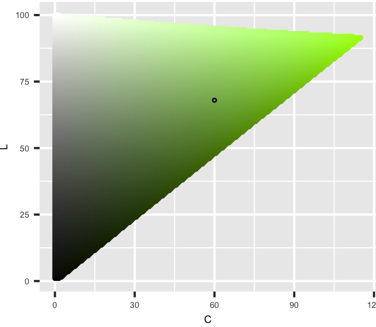
We can see as the Luminance increases, the shades move from darker to lighter, and as Chroma moves out from 0, the color is more intense. The get_C_L_plane function returns a data set with points on that plane. For this blog post, functions that start with “get” return points we’re going to graph while functions that start with “graph” display them appropriately. This plane actually extends to the left, where the H value would be the current H + 180. I’m not graphing that section because this project will keep values close to the base color without changing the Hue too much.
From here down, I’ll hide some of the code similar to previous sections to shorten the post. You can click on [texts] to show code if you want to see it.
Next, we can see the color falls with all the other colors for the same Chroma value. I think about Chroma values as tree rings. So, this image takes the HCL color space, drills out the center for lower Chroma values, then has you stand in the middle facing the Hue value, pulling the shape away from behind you and laying it flat.
[H-L Curve Code]
# H-L Curve ----
get_H_L_curve <- function(C_point) {
  expand_grid(H = seq(1, 360, 1),
              C = C_point,
              L = seq(1, 100, .5)) %>%
    mutate(color_value = hcl(H, C, L, fixup = FALSE)) %>%
    filter(!is.na(color_value))
}
H_L_curve <- get_H_L_curve(C_point)

label_H_center <- function(H_point, ...) {
  function(x) {(x + (180 - H_point)) %% 360}
}

graph_H_L_curve <- function(H_L_curve, color_points, color_hex, H_point) {
  ggplot() +
    geom_point(data = H_L_curve,
               aes((H + (180 - H_point)) %% 360, L,
                   color = color_value, fill = color_value)) +
    geom_point(data = color_points,
               aes((H + (180 - H_point)) %% 360, L,
                   color = "white", fill = "white")) +
    scale_color_identity() +
    scale_fill_identity() +
    geom_point(aes(x = 180, # Because we rotated points to not drop over edge
                   y = L_point),
               color = 'black',
               fill = color_hex,
               shape = 21,
               size = 2) +
    scale_x_reverse('H', # Like you're standing on the inside
                    labels = label_H_center(H_point = H_point),
                    limits = c(360, 0)) +
    coord_equal()
}
graph_H_L_curve(H_L_curve, color_points, color_hex, H_point)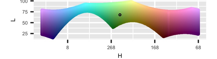
You can see the odd shape of the HCL color space where the different Hues don’t stretch their Chroma values out at different Luminance values. This is the only graph that shows a flattened curve. Everything else displays a sharp slice. For all the H-L curve graphs, the Hue value is rotated to the center.
Now we can look at cutting horizontally through the HCL color space where L = 68. (L_point = 68)
[H-C Plane Code]
# H-C plane ----
get_H_C_plane <- function(L_point){
  expand_grid(H = seq(1, 360, 1),
              C = seq(0, 180, .5),
              L = L_point) %>%
    mutate(color_value = hcl(H, C, L, fixup = FALSE)) %>%
    filter(!is.na(color_value))
}
H_C_plane <- get_H_C_plane(L_point)

graph_H_C_plane <- function(H_C_plane, color_points, color_hex) {
  ggplot() +
    geom_point(data = H_C_plane,
               aes(H, C, color = color_value, fill = color_value)) +
    geom_point(data = color_points,
               aes(H, C, color = "white", fill = "white")) +
    scale_color_identity() +
    scale_fill_identity() +
    scale_x_continuous(breaks = seq(45, 360, 45),
                       minor_breaks = seq(0, 315, 45) + 45/2,
                       labels = c('45', '90', '135', '180',
                                  '225', '270', '315', '0|360')) +
    scale_y_continuous(limits = c(0, 180)) +
    geom_point(aes(x = H_point,
                   y = C_point),
               color = 'black',
               fill = color_hex,
               shape = 21,
               size = 2) +
    coord_polar(start = 270 * pi / 180,
                direction = -1)
}
graph_H_C_plane(H_C_plane, color_points, color_hex)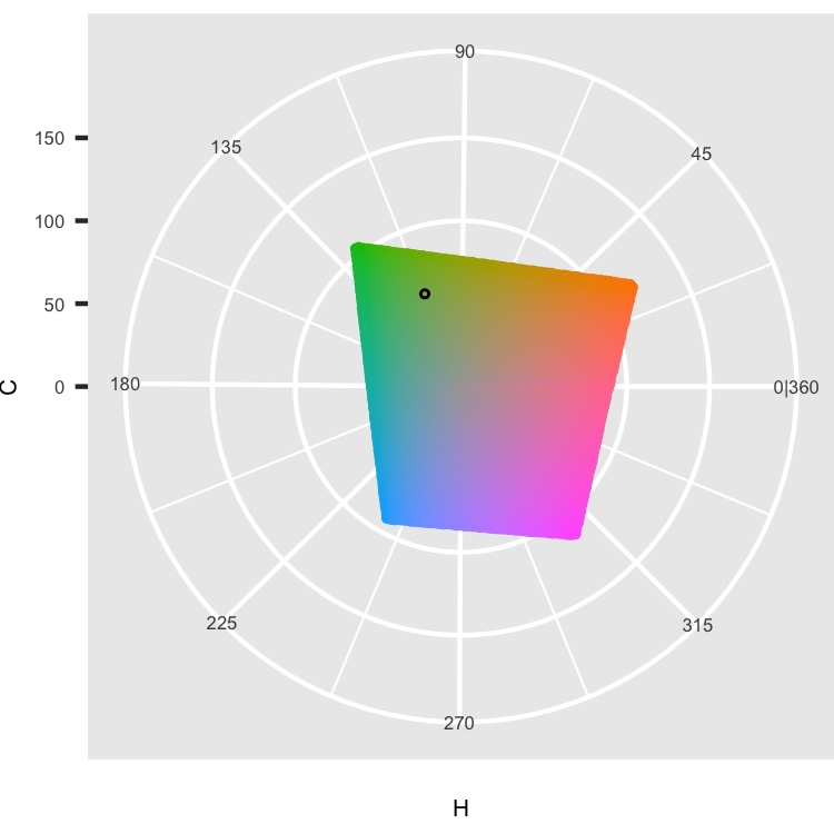
We can see the different colors as Hue moves around a circle and their increased intensity as Chroma moves out to the edges. The shape is not circular because the HCL color space isn’t.
There is one more graph to see. We looked at cutting the HCL color space along the Hue, Chroma, and Luminance values, but the Chroma image was a flattened curve. So instead, we can cut a plane at the Chroma value but tangent to the circle a constant Chroma value creates. The following image sets up the explanation, and then we’ll see the actual plane.
[C Tangent Plane Setup Code]
# C tangent plane ----
C_circle <- data.frame(H = seq(1, 360),
                       C = C_point,
                       color_value = "white")
C_tangent_plane <- expand_grid(x = C_point, # Plane perpendicular to H at C
                       perpendicular_from_C_L =
                         seq(-sqrt(180^2 - C_point^2), sqrt(180^2 - C_point^2)),
                       L = seq(1, 100, 1)) %>%
  mutate(x_rotate = x * cos(H_point * pi/180) -  # rotate
           perpendicular_from_C_L * sin(H_point * pi/180),
         y_rotate = x * sin(H_point * pi/180) +
           perpendicular_from_C_L * cos(H_point * pi/180)) %>%
  mutate(x = x_rotate,
         y = y_rotate) %>%
  select(-x_rotate, -y_rotate)  %>%
  mutate(H = (atan2(y, x) * 180/pi) %% 360,
         C = sqrt(x^2 + y^2)) %>%
  mutate(color_value = "white")
ggplot(data = H_C_plane,
       aes(H, C, color = color_value, fill = color_value)) +
  geom_point() +
  scale_color_identity() +
  scale_fill_identity() +
  scale_x_continuous(breaks = seq(45, 360, 45),
                     minor_breaks = seq(0, 315, 45) + 45/2,
                     labels = c('45', '90', '135', '180',
                                '225', '270', '315', '0|360')) +
  scale_y_continuous(limits = c(0, 180)) +
  geom_path(data = C_circle) +
  geom_segment(x = H_point,
               y = 0,
               xend = H_point,
               yend = C_point,
               col = "white") +
  geom_point(data = C_tangent_plane, col = "black") +
  geom_point(x = H_point,
             y = C_point,
             color = 'black',
             fill = color_hex,
             shape = 21) +
  coord_polar(start = 270 * pi / 180,
              direction = -1)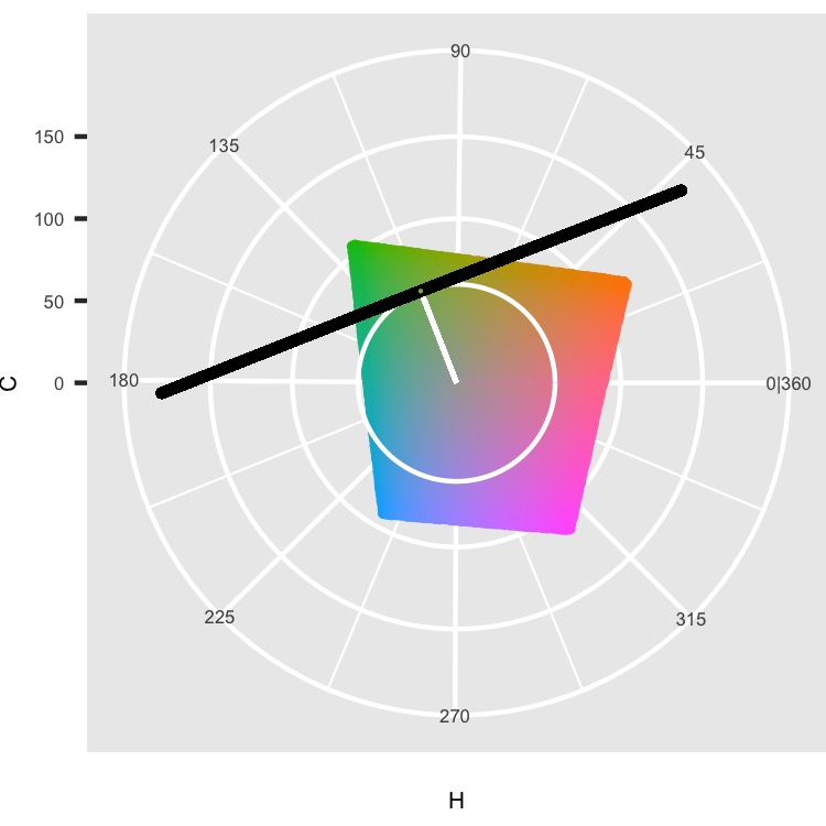
Chroma and Luminance move in straight lines, but Hue is circular. The image shows this with the white circle where Chroma and Luminance are constant, but Hue moves around the circle. This means looking at graphs of shapes can be distorted when graphing them flat. So we might want to see what happens as we move away from our specific color in a straight line perpendicular to the C-L Plane. That’s the black line. We’re going to cut the HCL space from top to bottom along this line.
[C Tangent Plane Code]
get_C_tangent_plane <- function(H_point, C_point) {
  expand_grid(x = C_point, # Plane perpendicular to H at C
              perpendicular_from_C_L = seq(-180, 180, .5),
              L = seq(1, 100, .5)) %>%
    mutate(x_rotate = x * cos(H_point * pi/180) -  # rotate
             perpendicular_from_C_L * sin(H_point * pi/180),
           y_rotate = x * sin(H_point * pi/180) +
             perpendicular_from_C_L * cos(H_point * pi/180)) %>%
    mutate(x = x_rotate,
           y = y_rotate) %>%
    select(-x_rotate, -y_rotate)  %>%
    mutate(H = (atan2(y, x) * 180/pi) %% 360,
           C = sqrt(x^2 + y^2)) %>%
    mutate(color_value = hcl(H, C, L, fixup = FALSE)) %>%
    filter(!is.na(color_value))
}
C_tangent_plane <- get_C_tangent_plane(H_point, C_point)

graph_C_tangent_plane <- function(C_tangent_plane, color_points, color_hex) {
  ggplot() +
    geom_point(data = C_tangent_plane,
               aes(perpendicular_from_C_L, L,
                   color = color_value, fill = color_value)) +
    geom_point(data = color_points,
               aes(perpendicular_from_C_L, L,
                   color = "white", fill = "white")) +
    scale_color_identity() +
    scale_fill_identity() +
    scale_x_reverse("Distance Perpendicular to C-L Plane",
                    labels = abs) +
    geom_point(aes(x = 0,
                   y = L_point),
               color = 'black',
               fill = color_hex,
               shape = 21,
               size = 2) +
    coord_equal()
}
graph_C_tangent_plane(C_tangent_plane, color_points, color_hex)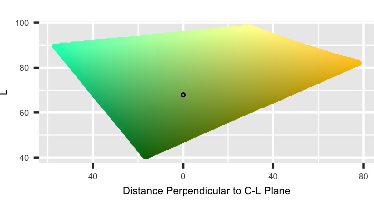
This shows the plane perpendicular to the C-L Plane at C = 60. A horizontal line drawn at the point on this image matches where the black intersects the H-C plane in the previous graph. This image isn’t super helpful here, but it will be when we check shapes later.
Nearby points in a sphere
Let’s start with drawing random points inside a sphere with a width of 5 centered on our base color.
The code below draws random points in a unit sphere, stretches it to be the right size, then moves it to our base color. After that, the code converts it to HCL coordinates, converts these to a color, then creates some nice variables to use for plotting later.
##------
# Sphere
##------
radius <- 5
n_points <- 250^2

color_points <- data.frame(x = rnorm(n = n_points),
                           y = rnorm(n = n_points),
                           z = rnorm(n = n_points),
                           U = runif(n = n_points)^(1/3)) %>%
  mutate(normalize = sqrt(x^2 + y^2 + z^2)) %>%
  mutate(x = x * U / normalize,
         y = y * U / normalize,
         z = z * U / normalize) %>%
  select(-U, -normalize) %>% # have random points in a sphere here
  mutate(x = x * radius, # stretch
         y = y * radius,
         z = z * radius) %>%
  mutate(x = x + C_point * cos(H_point * pi/180), # move
         y = y + C_point * sin(H_point * pi/180),
         z = z + L_point) %>%
  mutate(H = (atan2(y, x) * 180/pi) %% 360,
         C = sqrt(x^2 + y^2),
         L = z) %>%
  mutate(color_value = hcl(H, C, L, fixup = FALSE)) %>%
  mutate(perpendicular_from_C_L = x * sin(-H_point * pi/180) +
           y * cos(-H_point * pi/180),
         parallel_along_C_L = x * cos(-H_point * pi/180) -
           y * sin(-H_point * pi/180)) %>%
  mutate(row_value = sample(row_number(), n()),
         col_value = ceiling(row_value / sqrt(n_points))) %>%
  mutate(row_value = (row_value %% sqrt(n_points)) + 1)
Here we see the values, base color, and sample points.
[Sphere Info Code]
graph_info <- function(H_point, C_point, L_point) {
  color_hex <- hcl(H_point,
                   C_point,
                   L_point,
                   fixup = FALSE)

  ggplot() +
    geom_rect(aes(xmin = 0, xmax = 1,
                  ymin = 0, ymax = .5), col = color_hex, fill = color_hex) +
    geom_text(data = data.frame(x = 0,
                                y = seq(1.5, .75, -.25),
                                label = c(paste("HEX Value:", color_hex),
                                          paste("H Value:", H_point),
                                          paste("C Value:", C_point),
                                          paste("L Value:", L_point))),
              aes(x, y, label = label), hjust = 0, size = 4) +
    coord_equal() +
    theme_void()
}

graph_sample <- function(color_points) {
  ggplot(data = color_points,
         aes(x = row_value,
             y = col_value,
             fill = color_value)) +
    geom_tile() +
    coord_equal() +
    scale_fill_identity() +
    theme_void()
}

p1 <- graph_info(H_point, C_point, L_point)
p2 <- graph_sample(color_points)
p1 + p2
We can reuse the previous functions to graph the planes with our sphere in white to get the outline shape by using the new points as the color_points parameter. Then we can just graph the new points to see how they look. For example, in the following image, the left side has the previous C-L Plane image with points from the sphere blocked out in white. However, the right side has those same points with the correct color.
[C-L Plane Code]
graph_C_L <- function(color_points) {
  ggplot(data = color_points, aes(C, L, col = color_value, fill = color_value)) +
    geom_point() +
    scale_color_identity() +
    scale_fill_identity() +
    coord_equal() +
    theme(axis.line=element_blank(), axis.text.x=element_blank(),
          axis.text.y=element_blank(), axis.ticks=element_blank(),
          axis.title.x=element_blank(), axis.title.y=element_blank())
}

p1 <- graph_C_L_plane(C_L_plane, color_points, color_hex)
p2 <- graph_C_L(color_points)
p1 + p2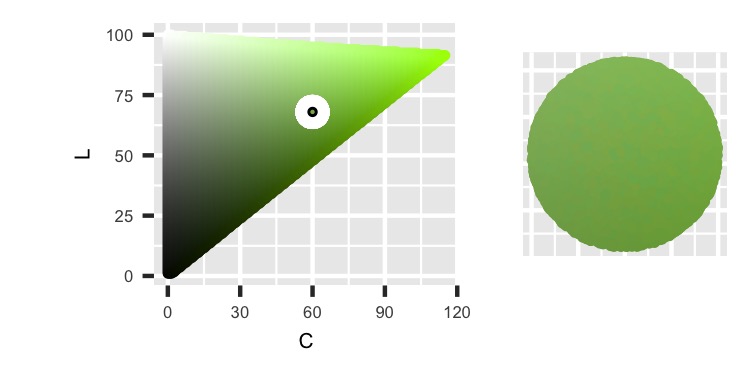
Now, we can continue with the others, starting with the H-L Curve. It’s hard to tell in this image, but the shape isn’t a perfect circle. It’s slightly off because the Hue values curve through the sphere, then that intersection is flattened in the graph. This distortion is more evident for different values.
[H-L Curve Code]
graph_H_L <- function(color_points, H_point) {
  ggplot(data = color_points, aes((H + (180 - H_point)) %% 360, L,
                                  col = color_value, fill = color_value)) +
    geom_point() +
    scale_color_identity() +
    scale_fill_identity() +
    scale_x_reverse() +
    coord_equal() +
    theme(axis.line=element_blank(), axis.text.x=element_blank(),
          axis.text.y=element_blank(), axis.ticks=element_blank(),
          axis.title.x=element_blank(), axis.title.y=element_blank())
}

p1 <- graph_H_L_curve(H_L_curve, color_points, color_hex, H_point)
p2 <- graph_H_L(color_points, H_point)
p1 + p2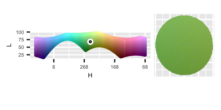
The next shape is a perfect circle because the plane perpendicular to the C-L Plane is already flat.
[C Tangent Plane Code]
graph_perpendicular_from_C_L <- function(color_points) {
  ggplot(data = color_points, aes(perpendicular_from_C_L, L,
                                  color = color_value, fill = color_value)) +
    geom_point() +
    scale_color_identity() +
    scale_fill_identity()  +
    scale_x_reverse() +
    coord_equal() +
    theme(axis.line=element_blank(), axis.text.x=element_blank(),
          axis.text.y=element_blank(), axis.ticks=element_blank(),
          axis.title.x=element_blank(), axis.title.y=element_blank())
}

p1 <- graph_C_tangent_plane(C_tangent_plane, color_points, color_hex)
p2 <- graph_perpendicular_from_C_L(color_points)
p1 + p2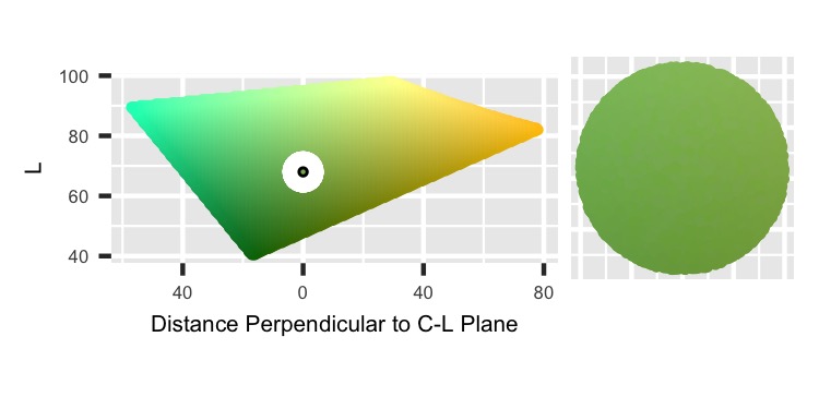
The last image is of the H-C Plane and the sphere based on x-y coordinates. The black line on the right-side is at H = 112.
[H-C Plane Code]
graph_x_y <- function(color_points, H_point) {
  ggplot(data = color_points, aes(x, y,
                                  col = color_value, fill = color_value)) +
    geom_abline(slope = c(tan(-67.5 * pi/180),
                          tan(-45 * pi/180),
                          tan(-22.5 * pi/180),
                          0,
                          100000,
                          tan(22.5 * pi/180),
                          tan(45 * pi/180),
                          tan(67.5 * pi/180)),
                intercept = 0,
                color = "white") +
    geom_abline(slope = tan(H_point * pi/180),
                intercept = 0,
                color = "black") +
    geom_point() +
    scale_color_identity() +
    scale_fill_identity() +
    coord_equal() +
    theme(axis.line=element_blank(), axis.text.x=element_blank(),
          axis.text.y=element_blank(), axis.ticks=element_blank(),
          axis.title.x=element_blank(), axis.title.y=element_blank(),
          panel.grid.major=element_blank(), panel.grid.minor=element_blank())
}

p1 <- graph_H_C_plane(H_C_plane, color_points, color_hex)
p2 <- graph_x_y(color_points, H_point)
p1 + p2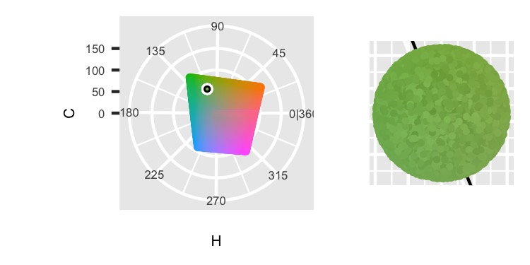
Now to expand this technique out a little more, we can stretch the sphere in different ways.
Nearby points in an ellipse
The following code starts and ends with the same lines as the previous code for points in a sphere. There’s are just two changes: stretching the sphere based on different amounts and rotating the points to line up the axes correctly. The radius parameter gets broken into three: H_radius, C_radius, and L_radius. The C_radius and L_radius stretch the sphere along those directions from the point. The H_radius is a slight misnomer because it’s stretching perpendicular to the C-L Plane, which is similar to how Hue changes but doesn’t exactly match the curve.
##-------
# Ellipse
##-------
H_radius <- 2.5
C_radius <- 5
L_radius <- 10

color_points <- data.frame(x = rnorm(n = n_points),
                           y = rnorm(n = n_points),
                           z = rnorm(n = n_points),
                           U = runif(n = n_points)^(1/3)) %>%
  mutate(normalize = sqrt(x^2 + y^2 + z^2)) %>%
  mutate(x = x * U / normalize,
         y = y * U / normalize,
         z = z * U / normalize) %>%
  select(-U, -normalize) %>% # have random points in a sphere here
  mutate(x = x * C_radius, # stretch
         y = y * H_radius,
         z = z * L_radius) %>%
  mutate(x_turn = x * cos(H_point * pi/180) -
           y * sin(H_point * pi/180), # rotate
         y_turn = x * sin(H_point * pi/180) +
           y * cos(H_point * pi/180)) %>%
  mutate(x = x_turn,
         y = y_turn) %>%
  select(-x_turn, -y_turn) %>%
  mutate(x = x + C_point * cos(H_point * pi/180), # move
         y = y + C_point * sin(H_point * pi/180),
         z = z + L_point) %>%
  mutate(H = (atan2(y, x) * 180/pi) %% 360,
         C = sqrt(x^2 + y^2),
         L = z) %>%
  filter(L >= 0 & L <= 100 & C >= 0) %>%
  mutate(color_value = hcl(H, C, L, fixup = FALSE)) %>%
  mutate(perpendicular_from_C_L = x * sin(-H_point * pi/180) +
           y * cos(-H_point * pi/180),
         parallel_along_C_L = x * cos(-H_point * pi/180) -
           y * sin(-H_point * pi/180)) %>%
  mutate(row_value = sample(row_number(), n()),
         col_value = ceiling(row_value / sqrt(n_points))) %>%
  mutate(row_value = (row_value %% sqrt(n_points)) + 1)
[Ellipse Info Code]
p1 <- graph_info(H_point, C_point, L_point)
p2 <- graph_sample(color_points)
p1 + p2
In this section’s images, we can see how the sphere gets stretched. If you’re standing in the center of the HCL color space and face the point, the sphere was extended to your left and right by the H_radius amount, to and away from you by C_radius, and vertically by L_radius.
[C-L Plane Code]
p1 <- graph_C_L_plane(C_L_plane, color_points, color_hex)
p2 <- graph_C_L(color_points)
p1 + p2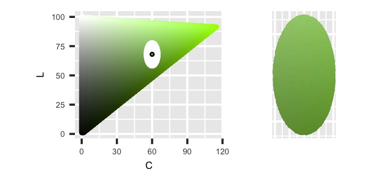
In the previous image, we can see the ellipse is 2 * L_radius tall and 2 * C_radius wide. In the following image, the ellipse is also 2 * L_radius tall. It changed horizontally but not by 2 * H_radius. This image displays the C_point radius circles as H changes through the HCL color space, so the distance of stretching is a function of the arc length of those circles. The next image has a width of 2 * H_radius.
[H-L Curve Code]
p1 <- graph_H_L_curve(H_L_curve, color_points, color_hex, H_point)
p2 <- graph_H_L(color_points, H_point)
p1 + p2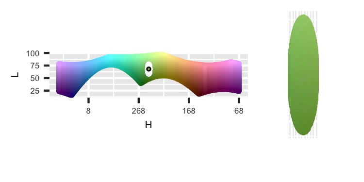
[C Tangent Plane Code]
p1 <- graph_C_tangent_plane(C_tangent_plane, color_points, color_hex)
p2 <- graph_perpendicular_from_C_L(color_points)
p1 + p2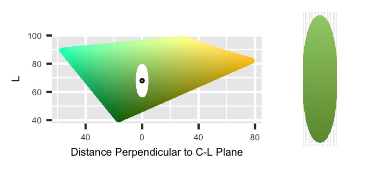
Finally, we see the H-C plane with an ellipse with one axis 2 * C_radius long and the other of 2 * H_radius. It’s pointing to the center, so which axis appears as height and width would change as H turns.
[H-C Plane Code]
p1 <- graph_H_C_plane(H_C_plane, color_points, color_hex)
p2 <- graph_x_y(color_points, H_point)
p1 + p2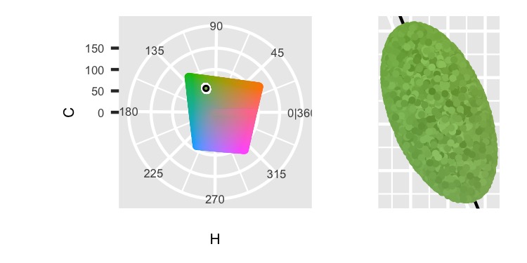
While we’re transforming the original sphere, we can add in tilting.
Nearby points in a tilted ellipse
I’m focusing on the Hue value for this project, so we’ll always tilt along the C-L Plane. Points with Hue = H_point will keep the same Hue as we rock the top and bottom either closer or farther from the center. Other points will change their Hue because they’ll move parallel to the C-L Plane and Hue is at an angle to this plane. We’ll change the Chroma and Luminance values for all points except the base color as we tilt.
The following code is the same as the previous one but adds tilting the ellipse by tilt_theta, the new parameter for the degree of tilt. In addition, the radius parameters have changed to map to the axis that is tilted, theta_radius, the other radius on the C-L Plane, other_C_L_radius, and the one perpendicular to the other two, perpendicular_C_L_radius (which fixes the H_radius misnomer).
A little code also finds the tilt_theta that points the ellipse towards the farthest point on the C-L Plane. This helps stretch the ellipse without hitting an edge (but any theta can be used).
##--------------
# Tilted Ellipse
##--------------
theta_radius <- 10
other_C_L_radius <- 3
perpendicular_C_L_radius <- 5

# Try rotating to point major axis to max chroma value
max_chromas <- max_chroma(h = H_point, l = seq(1, 100, .5))
tilt_theta <- atan2(seq(1, 100, .5)[max(max_chromas) == max_chromas] - L_point,
                     max(max_chromas) - C_point)

color_points <- data.frame(x = rnorm(n = n_points),
           y = rnorm(n = n_points),
           z = rnorm(n = n_points),
           U = runif(n = n_points)^(1/3)) %>%
  mutate(normalize = sqrt(x^2 + y^2 + z^2)) %>%
  mutate(x = x * U / normalize,
         y = y * U / normalize,
         z = z * U / normalize) %>%
  select(-U, -normalize) %>% # have random points in a sphere here
  mutate(x = x * theta_radius, # stretch
         y = y * other_C_L_radius,
         z = z * perpendicular_C_L_radius) %>%
  mutate(z_tilt = z * cos(tilt_theta) + x * sin(tilt_theta), # tilt
         x_tilt = z * -sin(tilt_theta) + x * cos(tilt_theta)) %>%
  mutate(x = x_tilt,
         z = z_tilt) %>%
  select(-x_tilt, -z_tilt) %>%
  mutate(x_turn = x * cos(H_point * pi/180) -
           y * sin(H_point * pi/180), # rotate
         y_turn = x * sin(H_point * pi/180) +
           y * cos(H_point * pi/180)) %>%
  mutate(x = x_turn,
         y = y_turn) %>%
  select(-x_turn, -y_turn) %>%
  mutate(x = x + C_point * cos(H_point * pi/180), # move
         y = y + C_point * sin(H_point * pi/180),
         z = z + L_point) %>%
  mutate(H = (atan2(y, x) * 180/pi) %% 360,
         C = sqrt(x^2 + y^2),
         L = z) %>%
  filter(L >= 0 & L <= 100 & C >= 0) %>%
  mutate(color_value = hcl(H, C, L, fixup = FALSE)) %>%
  mutate(perpendicular_from_C_L = x * sin(-H_point * pi/180) +
           y * cos(-H_point * pi/180),
         parallel_along_C_L = x * cos(-H_point * pi/180) -
           y * sin(-H_point * pi/180)) %>%
  mutate(row_value = sample(row_number(), n()),
         col_value = ceiling(row_value / sqrt(n_points))) %>%
  mutate(row_value = (row_value %% sqrt(n_points)) + 1)
[Tilted Ellipse Info Code]
p1 <- graph_info(H_point, C_point, L_point)
p2 <- graph_sample(color_points)
p1 + p2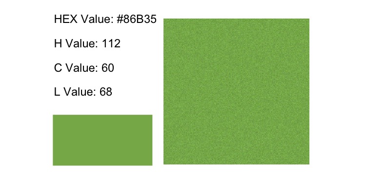
The following image shows the tilt the best. We can see that it now points to the tip of the triangle.
[C-L Plane Code]
p1 <- graph_C_L_plane(C_L_plane, color_points, color_hex)
p2 <- graph_C_L(color_points)
p1 + p2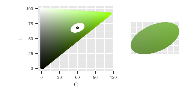
The right side isn’t quite symmetric across a horizontal line in the middle in the following image. The top is a little thinner than the bottom, so it’s more of an egg shape. That happens because the H values curve through the ellipse and flatten into this image. Different H values are obtained for different C values, and C and L are correlated in this shape. So in this image, as L changes, C also changes, which affects the H values reached by the edges. This graph won’t always result in an egg shape, but it does in this case.
[H-L Curve Code]
p1 <- graph_H_L_curve(H_L_curve, color_points, color_hex, H_point)
p2 <- graph_H_L(color_points, H_point)
p1 + p2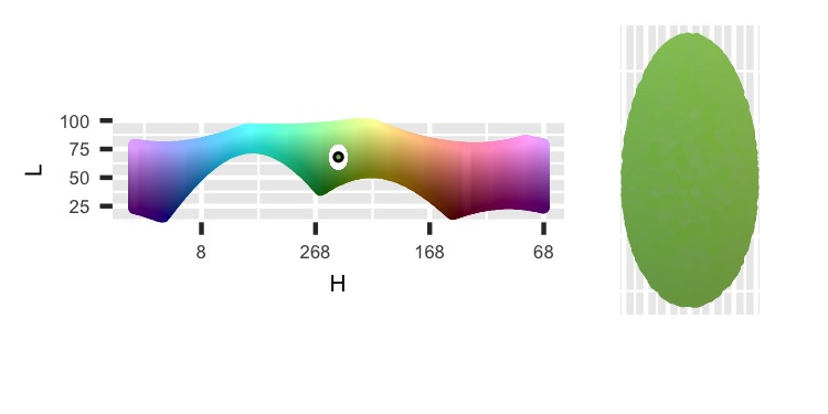
The next one is symmetric across a horizontal line in the middle. Checking this feature is one of the main reasons for this graph.
[C Tangent Plane Code]
p1 <- graph_C_tangent_plane(C_tangent_plane, color_points, color_hex)
p2 <- graph_perpendicular_from_C_L(color_points)
p1 + p2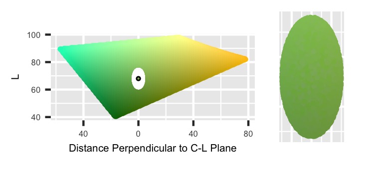
Finally, we see the H-C Plane. The length along the C-L Plane line is a function of the radii and tilt amount, but the perpendicular length is just perpendicular_C_L_radius.
[H-C Plane Code]
p1 <- graph_H_C_plane(H_C_plane, color_points, color_hex)
p2 <- graph_x_y(color_points, H_point)
p1 + p2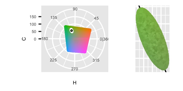
So far, this setup has a lot of flexibility but is also fragile. So, we’ll bulk up the sampling function.
Clean up the final function
There are a couple of ways to get points that don’t have actual values, such as outside useable Chroma values or Luminance values outside [0, 100]. To handle this, we’ll add in a feature that over samples points, only keeps the ones that have a color, then samples down to the desired amount. The new oversample parameter adds in the extra points. Of course, this could be down in a while loop, but this is fast enough and normally works.
We might also want to limit the Hue values. For example, if we only want red colors without going into purple or orange, we can block samples too far away based on their H values, even if our perpendicular_C_L_radius is too large. We’ll just crop any points out that go past those bounds.
Finally, the HCL color space is oddly shaped, so it’s possible to sample points distributed unevenly along either side of the H_point value. That could shift the overall average Hue. To prevent that, I’m adding a catch that if the point couldn’t exist on the other side of the Hue values, then discard it. That’ll make the final regions trimmed out of the ellipse to be symmetric across H_point.
##--------
# Clean up
##--------
# sampling, hitting edges
# within h bounds, this also catches C on the other side
# symmetric on H

H_bound <- 3 # up to 90
get_color_points <- function(n_points, oversample,
                             H_point, C_point, L_point,
                             theta_radius, other_C_L_radius,
                             perpendicular_C_L_radius,
                             tilt_theta, H_bound) {
  data.frame(x = rnorm(n = n_points * oversample), # over sample in case some points fail
             y = rnorm(n = n_points * oversample),
             z = rnorm(n = n_points * oversample),
             U = runif(n = n_points * oversample)^(1/3)) %>%
    mutate(normalize = sqrt(x^2 + y^2 + z^2)) %>%
    mutate(x = x * U / normalize,
           y = y * U / normalize,
           z = z * U / normalize) %>%
    select(-U, -normalize) %>% # have random points in a sphere here
    mutate(x = x * theta_radius, # stretch
           y = y * other_C_L_radius,
           z = z * perpendicular_C_L_radius) %>%
    mutate(z_tilt = z * cos(tilt_theta) + x * sin(tilt_theta), # tilt
           x_tilt = z * -sin(tilt_theta) + x * cos(tilt_theta)) %>%
    mutate(x = x_tilt,
           z = z_tilt) %>%
    select(-x_tilt, -z_tilt) %>%
    mutate(x_turn = x * cos(H_point * pi/180) - y * sin(H_point * pi/180), # rotate
           y_turn = x * sin(H_point * pi/180) + y * cos(H_point * pi/180)) %>%
    mutate(x = x_turn,
           y = y_turn) %>%
    select(-x_turn, -y_turn) %>%
    mutate(x = x + C_point * cos(H_point * pi/180), # move
           y = y + C_point * sin(H_point * pi/180),
           z = z + L_point) %>%
    mutate(H = (atan2(y, x) * 180/pi) %% 360,
           C = sqrt(x^2 + y^2),
           L = z) %>%
    filter(L >= 0 & L <= 100 & C >= 0) %>%
    mutate(color_value = hcl(H, C, L, fixup = FALSE)) %>%
    filter(!is.na(color_value)) %>% # check if exists
    mutate(H_diff = (180 - abs(abs(H - H_point) - 180)) *
             sign(180 - abs(H - H_point)) * sign(H - H_point)) %>% # H diff, check if crosses 360
    filter(abs(H_diff) <= H_bound) %>% # check in H bound
    filter(!is.na(hcl(H_point - H_diff, C, L, fixup = FALSE))) %>% # symmetric
    select(!H_diff) %>%
    sample_n(n_points) %>% # sample down to desired amount
    mutate(perpendicular_from_C_L = x * sin(-H_point * pi/180) +
             y * cos(-H_point * pi/180),
           parallel_along_C_L = x * cos(-H_point * pi/180) -
             y * sin(-H_point * pi/180)) %>%
    mutate(row_value = sample(row_number(), n()),
           col_value = ceiling(row_value / sqrt(n_points))) %>%
    mutate(row_value = (row_value %% sqrt(n_points)) + 1)
}

color_points <- get_color_points(250^2, 10,
                                 H_point, C_point, L_point,
                                 theta_radius, other_C_L_radius,
                                 perpendicular_C_L_radius,
                                 tilt_theta, H_bound)
Compare previous samples
Now we can try this function with the previous values to confirm how it works.
##-------
# Compare
##-------
H_bound <- 90
color_points_sphere <- get_color_points(250^2, 10,
                                        H_point, C_point, L_point,
                                        theta_radius = radius,
                                        other_C_L_radius = radius,
                                        perpendicular_C_L_radius = radius,
                                        tilt_theta = 0, H_bound)
color_points_ellipse <- get_color_points(250^2, 10,
                                         H_point, C_point, L_point,
                                         theta_radius = C_radius,
                                         other_C_L_radius = H_radius,
                                         perpendicular_C_L_radius = L_radius,
                                         tilt_theta = 0, H_bound)
color_points_tilted_ellipse <- get_color_points(250^2, 10,
                                                H_point, C_point, L_point,
                                                theta_radius,
                                                other_C_L_radius,
                                                perpendicular_C_L_radius,
                                                tilt_theta, H_bound)

p1 <- graph_sample(color_points_sphere)
p2 <- graph_sample(color_points_ellipse)
p3 <- graph_sample(color_points_tilted_ellipse)
p1 + p2 + p3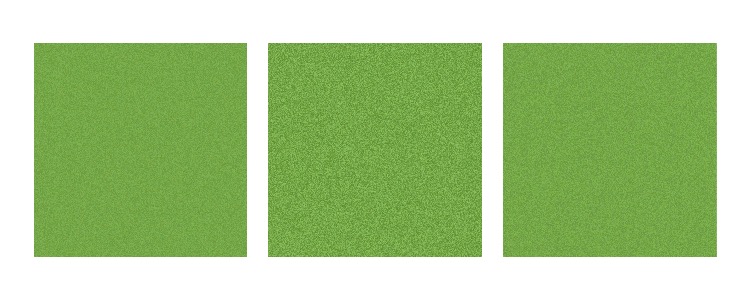
Here, we can see the differences in samples based on the different parameters. By changing the parameters, we can get a variety of color sampling, even when starting with the same base point. The rest of the graphs can be created for comparing the outputs, but they aren’t that interesting since they’re just repeats of the previous image.
Trying some other parameters
Now that we have all our functions set up let’s try them out on two more examples. The first one will be on an ellipse that hits the edge.
#--------------------
# Try some other ones
#--------------------

# Outside Edge ----
H_point <- 63
C_point <- 93
L_point <- 81

color_hex <- hcl(H_point,
                 C_point,
                 L_point,
                 fixup = FALSE)

C_L_plane <- get_C_L_plane(H_point)
H_L_curve <- get_H_L_curve(C_point)
C_tangent_plane <- get_C_tangent_plane(H_point, C_point)
H_C_plane <- get_H_C_plane(L_point)

theta_radius <- 40
other_C_L_radius <- 3
perpendicular_C_L_radius <- 5

tilt_theta <- 0
H_bound <- 90

color_points <- get_color_points(250^2, 10,
                                 H_point, C_point, L_point,
                                 theta_radius, other_C_L_radius,
                                 perpendicular_C_L_radius,
                                 tilt_theta, H_bound)
[Outside Edge Info Code]
p1 <- graph_info(H_point, C_point, L_point)
p2 <- graph_sample(color_points)
p1 + p2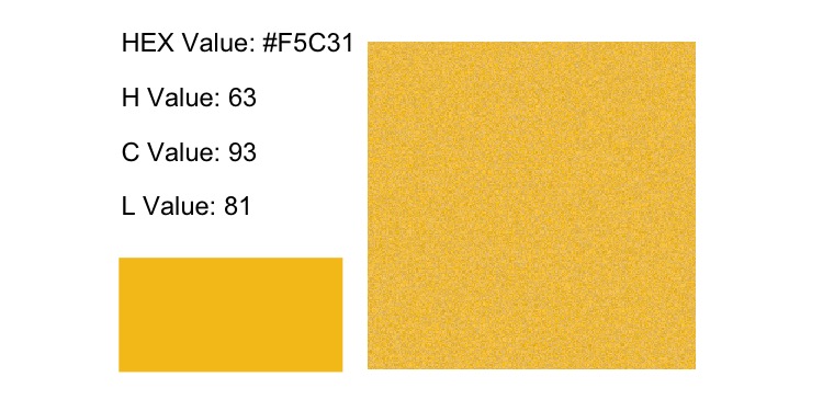
The following image shows that the ellipse should go outside the bounds, but there aren’t any color values for those points. So, the ellipse is clipped off by that bound. However, the square on the right in the previous image is filled in completely. If we started with a sample of the size we wanted at the end, the clipped points would be missing. The previous image worked because the original set of points was bigger, clipped, then sampled to the desired amount.
[C-L Plane Code]
p1 <- graph_C_L_plane(C_L_plane, color_points, color_hex)
p2 <- graph_C_L(color_points)
p1 + p2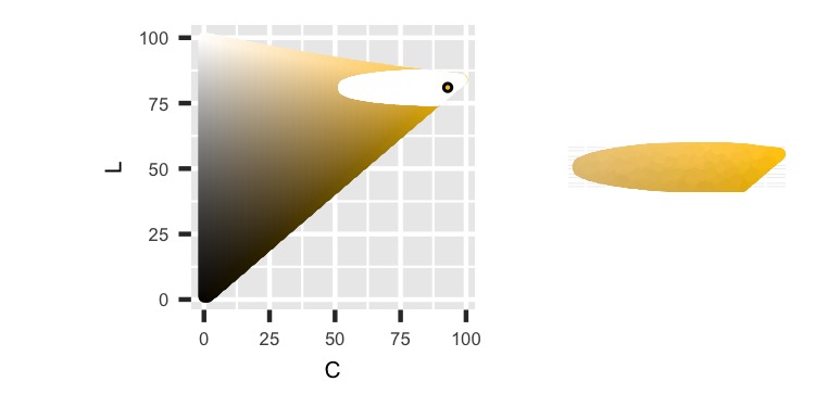
The next few images are the same kind that we have seen previously.
[H-L Curve Code]
p1 <- graph_H_L_curve(H_L_curve, color_points, color_hex, H_point)
p2 <- graph_H_L(color_points, H_point)
p1 + p2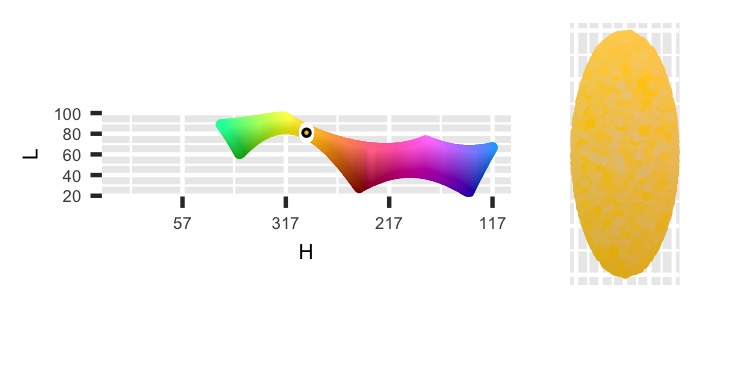
[C Tangent Plane Code]
p1 <- graph_C_tangent_plane(C_tangent_plane, color_points, color_hex)
p2 <- graph_perpendicular_from_C_L(color_points)
p1 + p2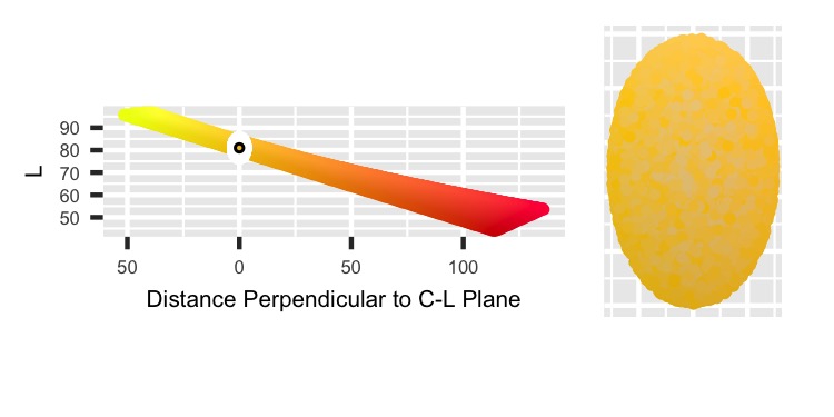
[H-C Plane Code]
p1 <- graph_H_C_plane(H_C_plane, color_points, color_hex)
p2 <- graph_x_y(color_points, H_point)
p1 + p2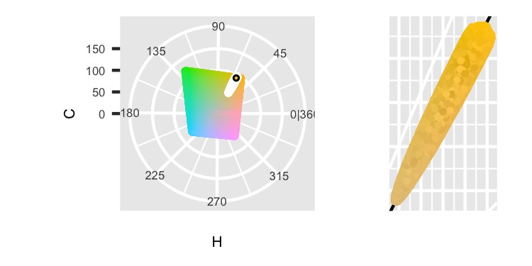
One important detail to catch in the above image is the sharp end on the top right. This clipping occurs because we check that the image is symmetric across Hue = H_point. If we didn’t have that check, the right side would stretch up farther to match the boundary of the H-C Plane on the left side.
Finally, we can end this post with one more example. For this one, we’ll place the ellipse near the inside of the HCL color space.
# Inside Edge ----
H_point <- 319
C_point <- 10
L_point <- 50

color_hex <- hcl(H_point,
                 C_point,
                 L_point,
                 fixup = FALSE)

C_L_plane <- get_C_L_plane(H_point)
H_L_curve <- get_H_L_curve(C_point)
C_tangent_plane <- get_C_tangent_plane(H_point, C_point)
H_C_plane <- get_H_C_plane(L_point)

theta_radius <- 40
other_C_L_radius <- 5
perpendicular_C_L_radius <- 20

tilt_theta <- 90 * pi/180
H_bound <- 45

color_points <- get_color_points(250^2, 10,
                                 H_point, C_point, L_point,
                                 theta_radius, other_C_L_radius,
                                 perpendicular_C_L_radius,
                                 tilt_theta, H_bound)
[Inside Edge Info Code]
p1 <- graph_info(H_point, C_point, L_point)
p2 <- graph_sample(color_points)
p1 + p2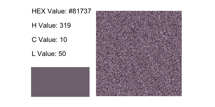
[C-L Plane Code]
p1 <- graph_C_L_plane(C_L_plane, color_points, color_hex)
p2 <- graph_C_L(color_points)
p1 + p2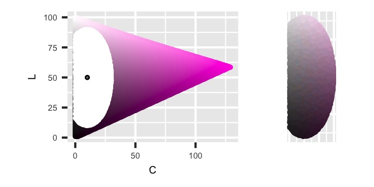
The H-L Curve is very different from previous ones because of how close to the center the C_point is. Values close to the center span a larger region of Hue values than compared to points farther away to the outside, which creates a new shape.
[H-L Curve Code]
p1 <- graph_H_L_curve(H_L_curve, color_points, color_hex, H_point)
p2 <- graph_H_L(color_points, H_point)
p1 + p2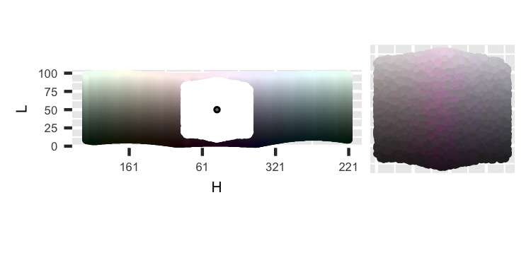
[C Tangent Plane Code]
p1 <- graph_C_tangent_plane(C_tangent_plane, color_points, color_hex)
p2 <- graph_perpendicular_from_C_L(color_points)
p1 + p2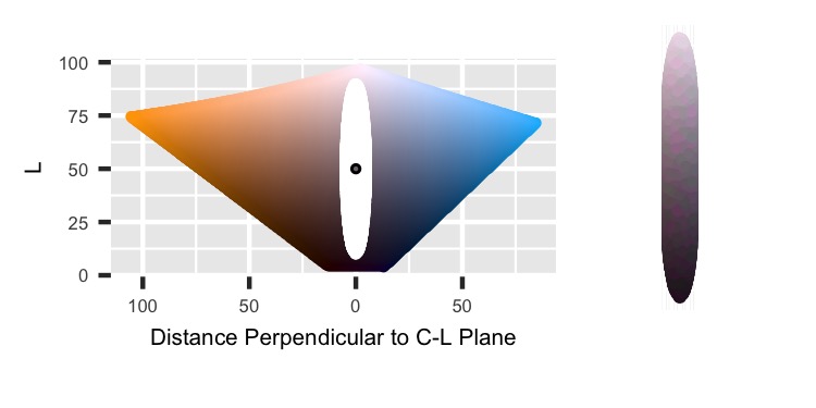
For the final image, we can see that the H_bound cuts up the ellipse. The boundary prevents the ellipse from stretching across the HCL color space’s middle.
[H-C Plane Code]
p1 <- graph_H_C_plane(H_C_plane, color_points, color_hex)
p2 <- graph_x_y(color_points, H_point)
p1 + p2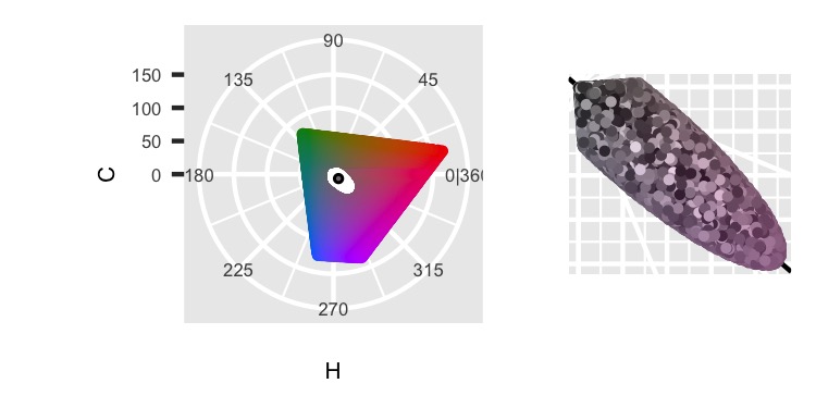
There are a few options to continue this work further. This code uses the tidyverse with many mutate steps, but it can be done squished together or done with matrix multiplication/other more efficient techniques. There are also different parameterizations, such as the two foci for an ellipse. There could also be options for other clipping or not including some of the current clipping (like keeping symmetric across H_point).